02-ggplot2 绘图基础
1 笔记与练习参考
R 可视化的内容主要来源于 [R Graphics Cookbook, 2nd edition](https://r-graphics.org/) 和 [Beautiful-Visualization-with-R](https://github.com/EasyChart/Beautiful-Visualization-with-R)(Zhang 2019)
2 准备工作
ggplot2 绘图基础需要安装 ggplot2,dplyr,gcookbook三个包,其中gcookbook包含了需要使用的数据集。
2.1 安装package
可以通过如下方式安装:
2.2 载入package
在每个R会话中,需要再运行代码之前加载这几个包:
{r,eval=false} library(tidyverse) library(gcookbook)
2.2.1 注意
运行library(tidyverse)会加载 ggplot2,dplyr等许多其他包,如果想要R会话更加流畅高效,可以分别加载ggplot2,dplyr,gcookbook等。
2.3 更新package
运行 update.packages() 可以查看那些包可以被更新,如果想要不加提示的更新说有的package,可以加入参数:ask=FALSE。
{r,eval=FALSE} update.packages(ask=FALSE)
2.3.1 注意
一般来说package的作者会发布一些新版本来修复旧版本中的问题,并提供一些新特征或功能,通常是建议将packages更新到最新版。但是有时候可能会出现一些bug或package之间的冲突,可以通过版本控制/构建虚拟环境来进行解决。
2.4 加载以符号分隔的文本文件
- 一般的加载语法
- render 包中的
read_csv()函数,这个函数的运行速度比read.csv()快很多,且更适合处理字符串、日期和时间数据。 - 如果数据文件首列没有列明:
2.5 从Excel文件中加载数据
可以使用 readxl 包中的 read_excel() 函数用于读取 .xls、.xlsx等Excel文件。
read_excel() 默认使用工作标的第一行作为列名,如果不想以第一行作为列名,可以设置参数 col_names = FALSE ,相应的,各列会被命名为 X1,X2 等。
2.6 从SPSS/SAS/Stata文件中加载数据
2.6.1 使用 haven 包中的函数
2.6.2 使用 foreign 包替代
这个同样支持 SPSS 和 Stata 数据,但是这个包更新缓慢。
它还可以支持octave/MATLAB,SYSTAT,SAS XPORT等数据的读取。
通过 ls("package:foreign") 查看所有的函数列表。
 [1] "data.restore"  "lookup.xport"  "read.arff"     "read.dbf"
 [5] "read.dta"      "read.epiinfo"  "read.mtp"      "read.octave"
 [9] "read.S"        "read.spss"     "read.ssd"      "read.systat"
[13] "read.xport"    "write.arff"    "write.dbf"     "write.dta"
[17] "write.foreign"
2.7 链接函数和管道操作符 %>%
    Expt Run Speed
001    1   1   850
002    1   2   740
003    1   3   900
004    1   4  1070
005    1   5   930
006    1   6   850
007    1   7   950
008    1   8   980
009    1   9   980
010    1  10   880
011    1  11  1000
012    1  12   980
013    1  13   930
014    1  14   650
015    1  15   760
016    1  16   810
017    1  17  1000
018    1  18  1000
019    1  19   960
020    1  20   960
021    2   1   960
022    2   2   940
023    2   3   960
024    2   4   940
025    2   5   880
026    2   6   800
027    2   7   850
028    2   8   880
029    2   9   900
030    2  10   840
031    2  11   830
032    2  12   790
033    2  13   810
034    2  14   880
035    2  15   880
036    2  16   830
037    2  17   800
038    2  18   790
039    2  19   760
040    2  20   800
041    3   1   880
042    3   2   880
043    3   3   880
044    3   4   860
045    3   5   720
046    3   6   720
047    3   7   620
048    3   8   860
049    3   9   970
050    3  10   950
051    3  11   880
052    3  12   910
053    3  13   850
054    3  14   870
055    3  15   840
056    3  16   840
057    3  17   850
058    3  18   840
059    3  19   840
060    3  20   840
061    4   1   890
062    4   2   810
063    4   3   810
064    4   4   820
065    4   5   800
066    4   6   770
067    4   7   760
068    4   8   740
069    4   9   750
070    4  10   760
071    4  11   910
072    4  12   920
073    4  13   890
074    4  14   860
075    4  15   880
076    4  16   720
077    4  17   840
078    4  18   850
079    4  19   850
080    4  20   780
081    5   1   890
082    5   2   840
083    5   3   780
084    5   4   810
085    5   5   760
086    5   6   810
087    5   7   790
088    5   8   810
089    5   9   820
090    5  10   850
091    5  11   870
092    5  12   870
093    5  13   810
094    5  14   740
095    5  15   810
096    5  16   940
097    5  17   950
098    5  18   800
099    5  19   810
100 5 20 870 Expt Run Speed
Min. :1 Min. : 1.00 Min. : 650
1st Qu.:1 1st Qu.: 5.75 1st Qu.: 850
Median :1 Median :10.50 Median : 940
Mean :1 Mean :10.50 Mean : 909
3rd Qu.:1 3rd Qu.:15.25 3rd Qu.: 980
Max. :1 Max. :20.00 Max. :1070 2.7.1 普通函数
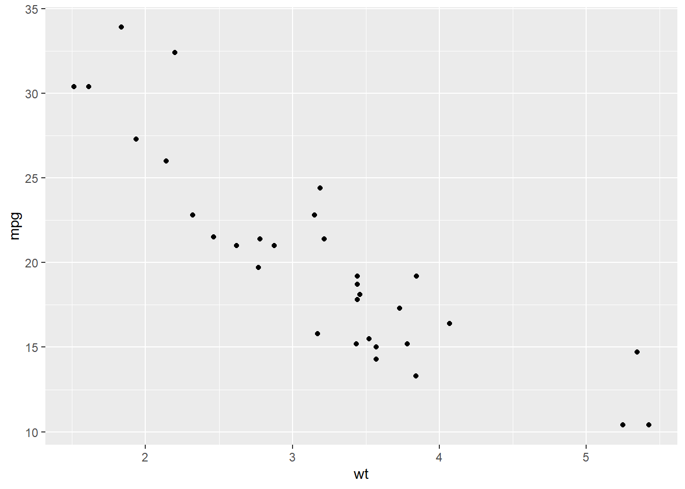
2.8 绘制散点图
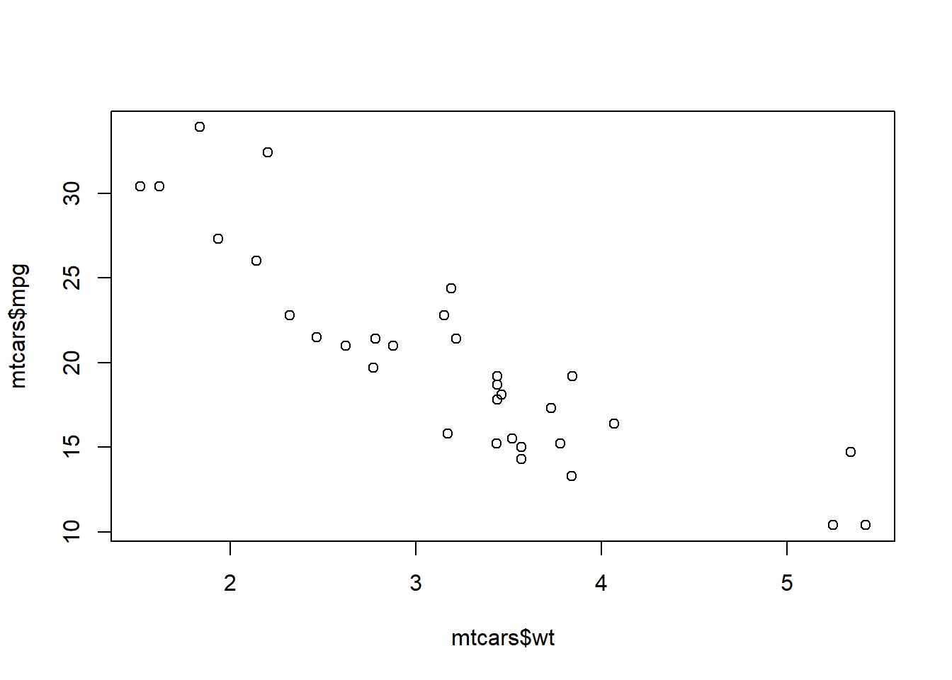
使用 ggplot2 绘制
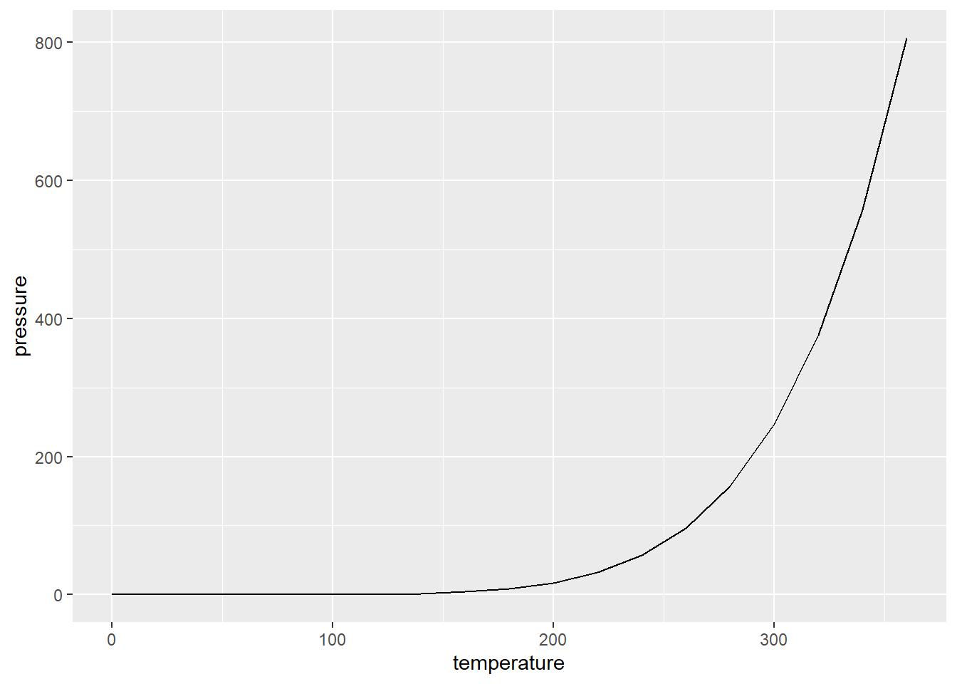
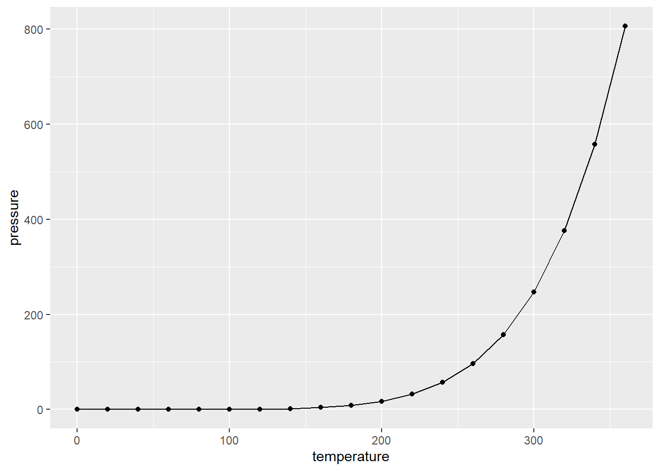
2.9 绘制折线图
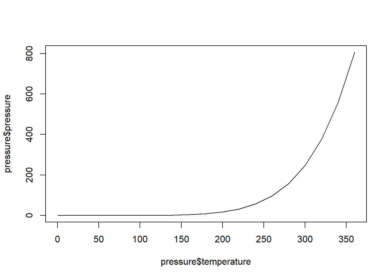
2.9.1 增加数据点和多条折线
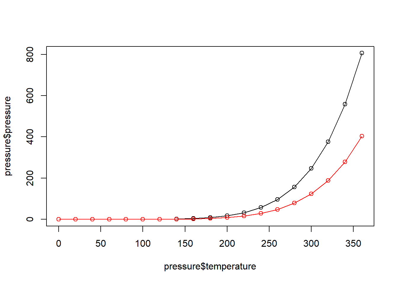
2.9.2 ggplot2 中的 geom_line()
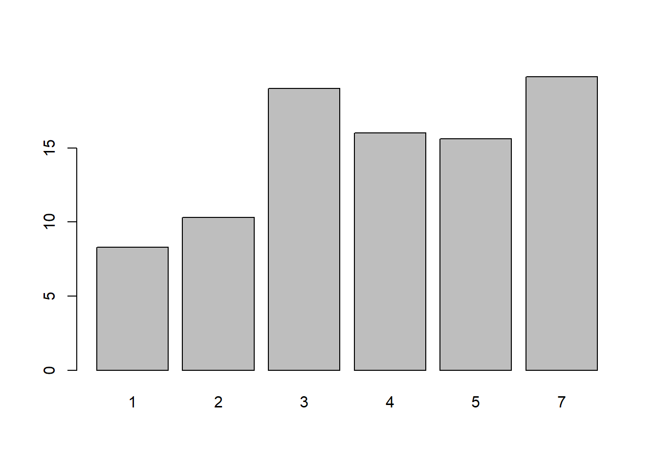
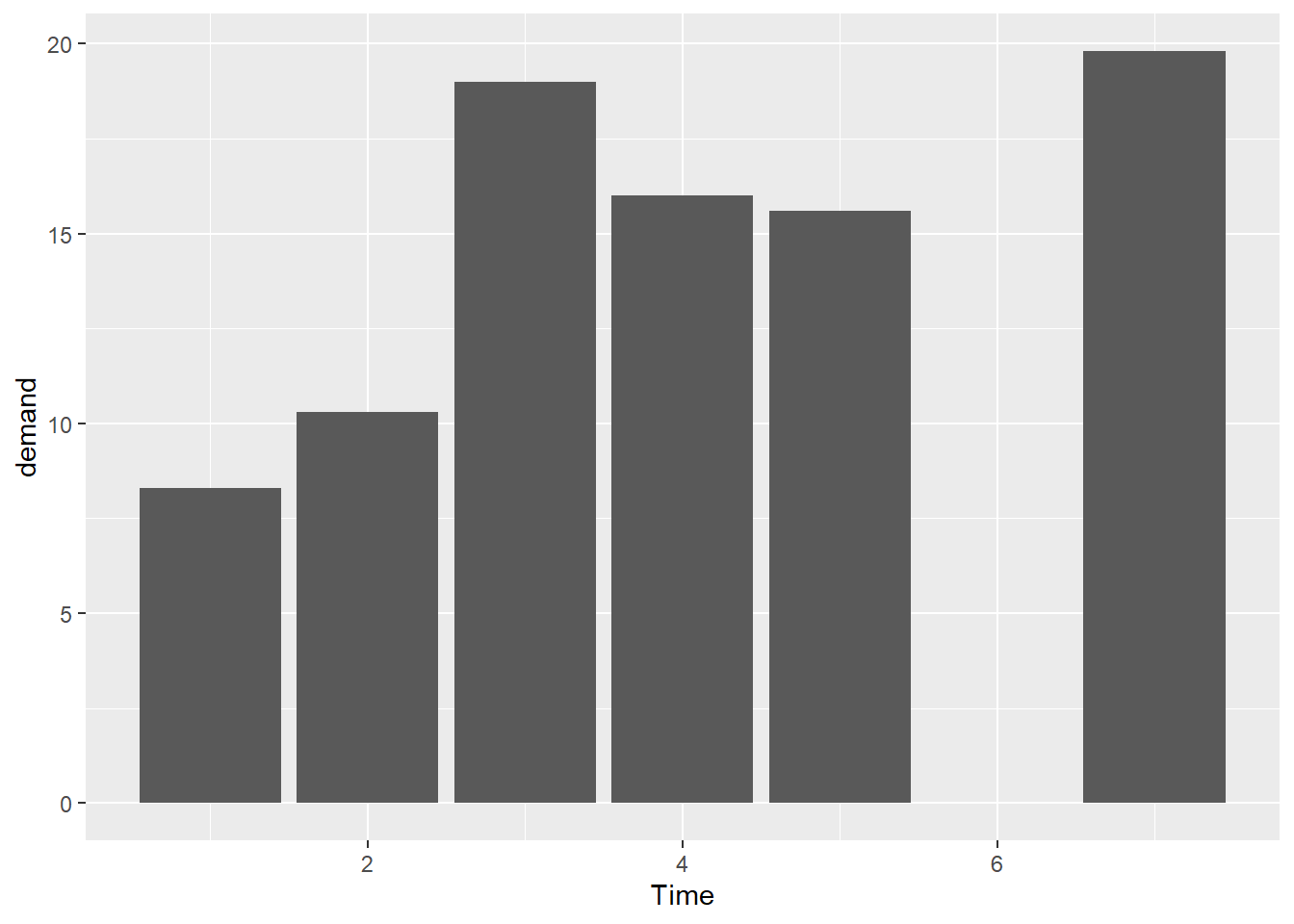
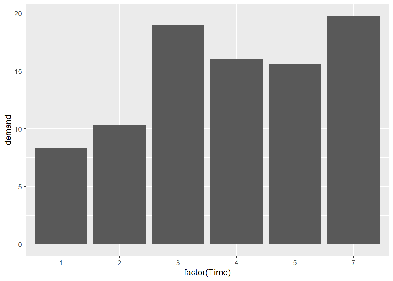
2.10 绘制条形图
2.10.1 使用 barplot() 函数
向 barplot() 函数传递两个参数,第一个向量用来设定条形的高度,第二个向量用来设定每个条形对应的标签(可选);如果向量中的元素已被命名,则系统会自动使用元素的名字作为条形标签。
2.10.2 使用 ggplot2 中的 geom_col 函数
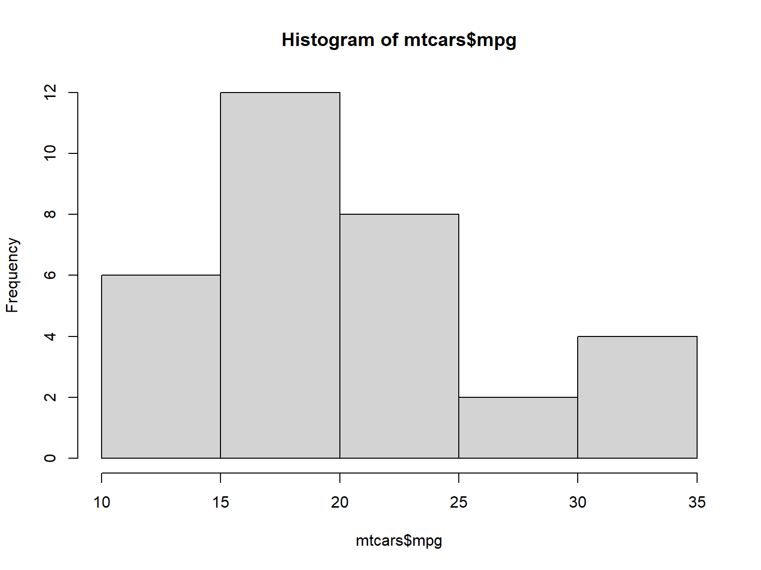
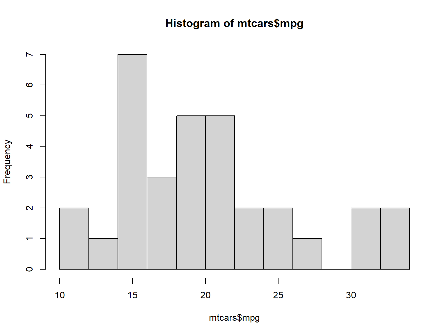
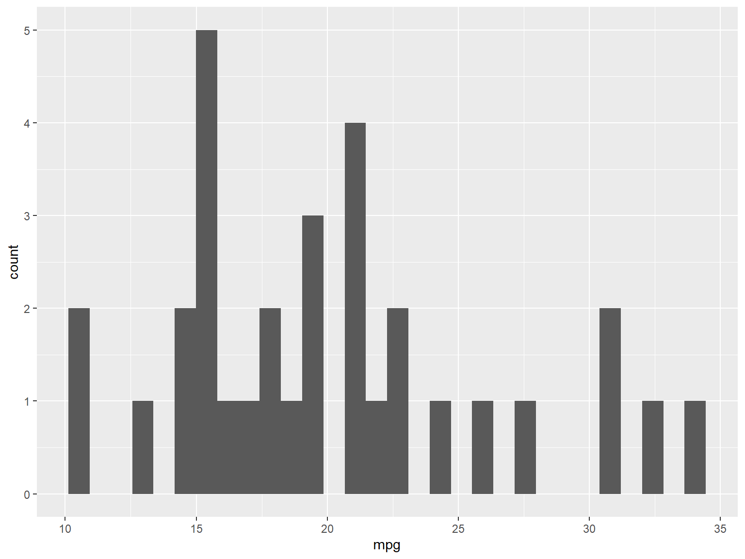
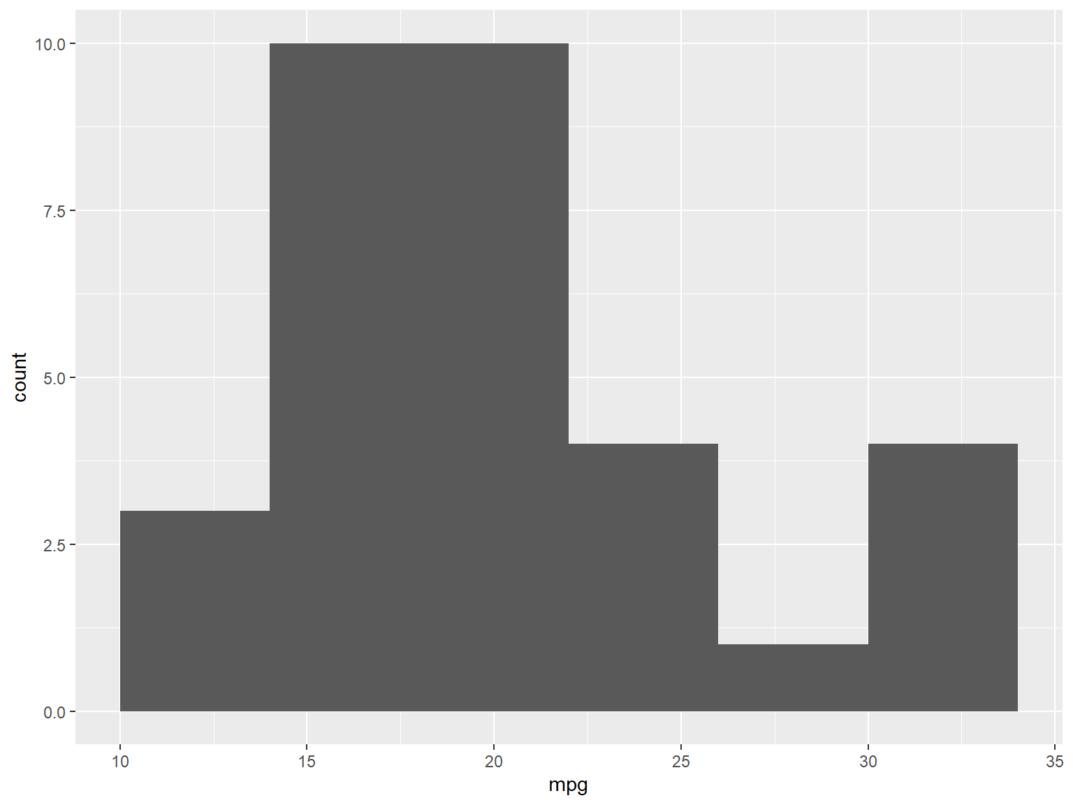
2.11 绘制直方图
使用 hist() 函数#| echo: true #| output: true #| cache: true
2.11.1 使用 ggplot2 中的 geom_histogram()
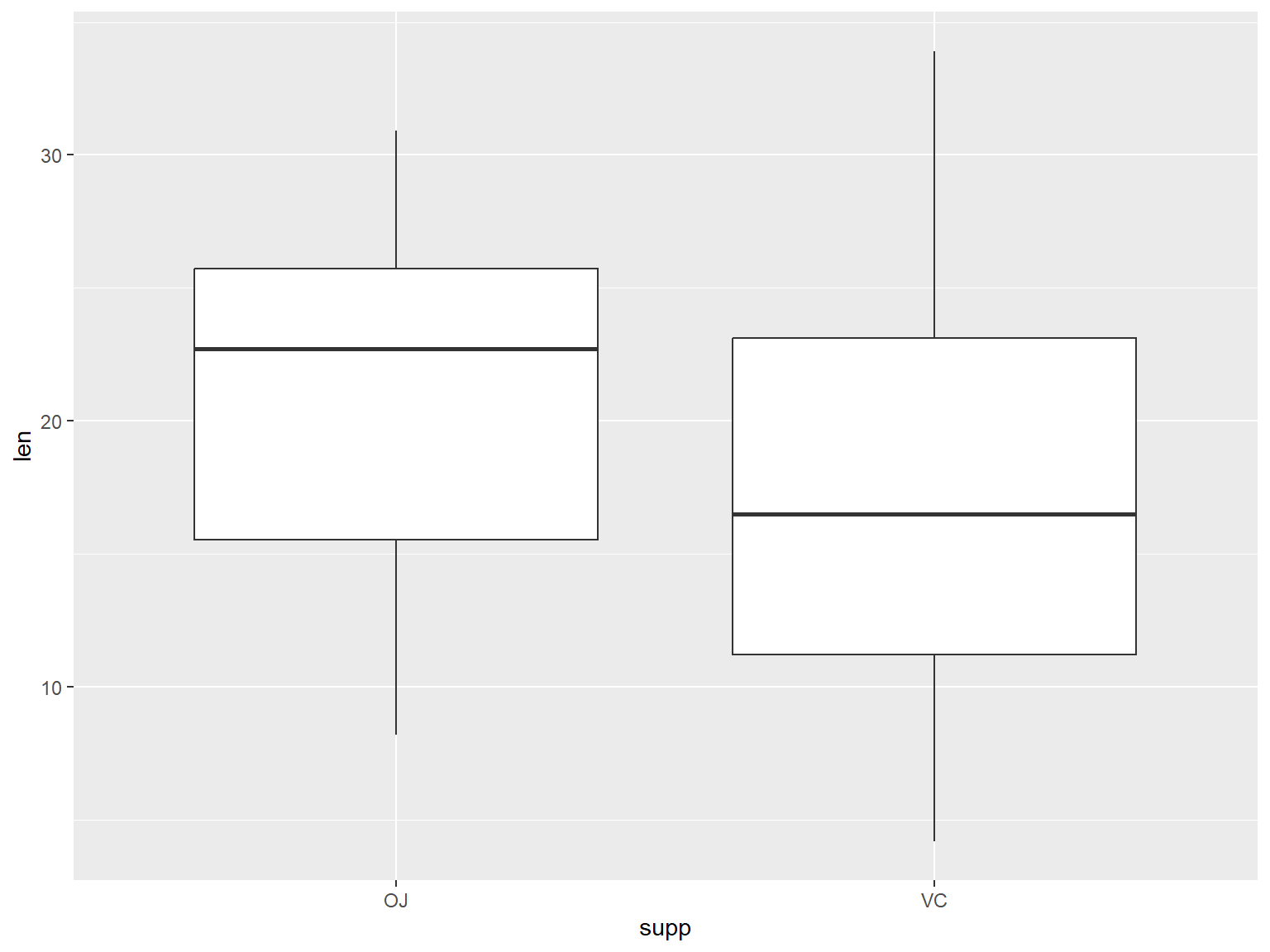
2.12 绘制箱型图
2.13 使用 plot() 函数
当 X 为因子型变量(与数值型变量对应)时,会默认绘制线形图。
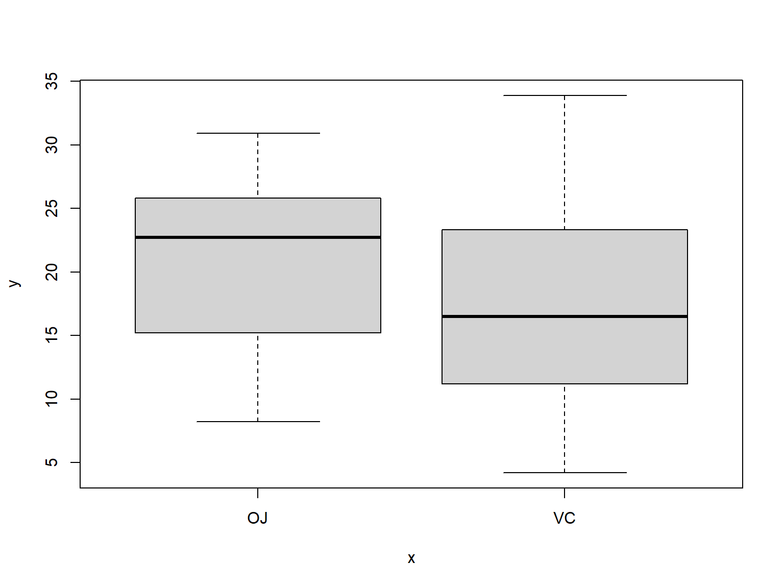
当两个参数向量在同一个数据框时,也可以使用 boxplot() 函数和语法。公式语法允许用户在 x 轴上使用变量组合。
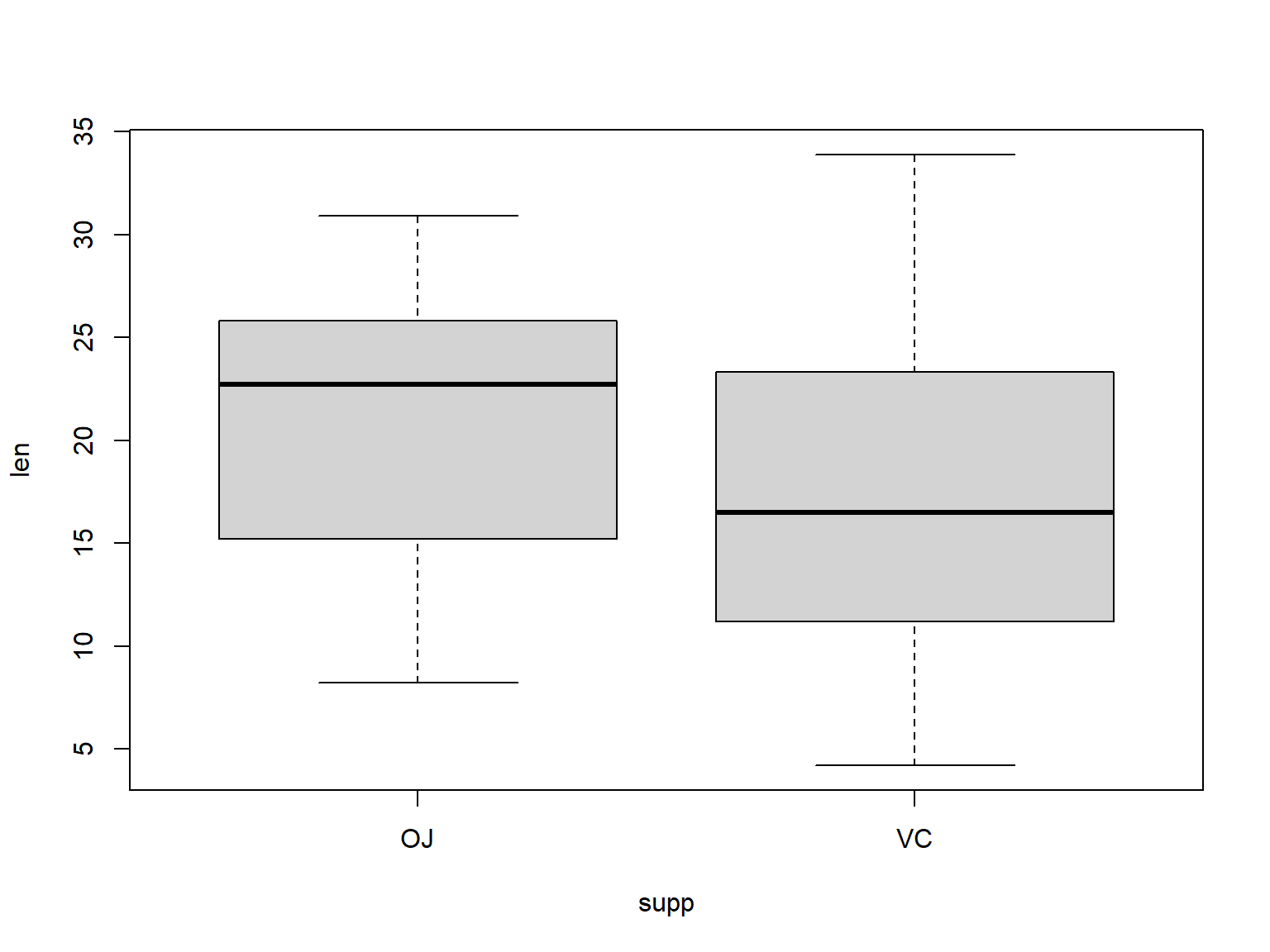
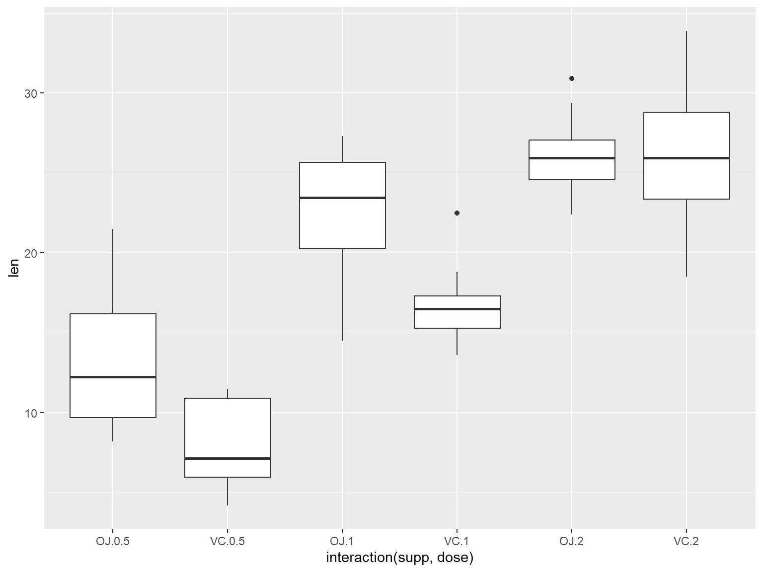
引入交互,基于多组变量的箱型图。
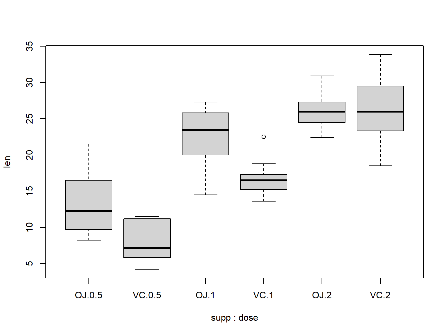
2.13.1 使用 ggplot2 中的 geom_boxplot() 函数
使用 interaction() 函数将分组变量组合在一起来绘制基于多组变量的箱型图。
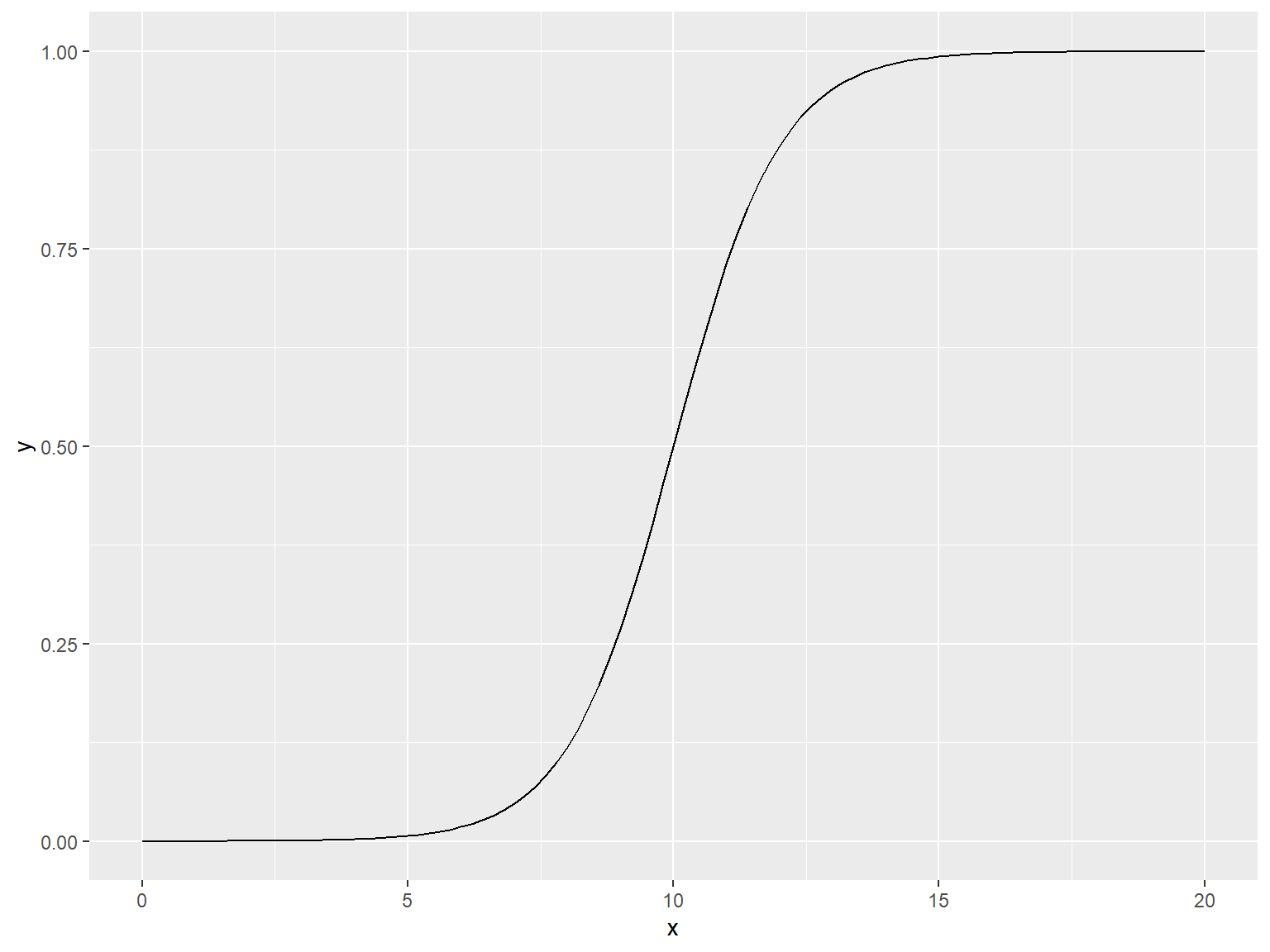
2.14 绘制函数图像
2.14.1 使用 curve() 函数绘制函数图像
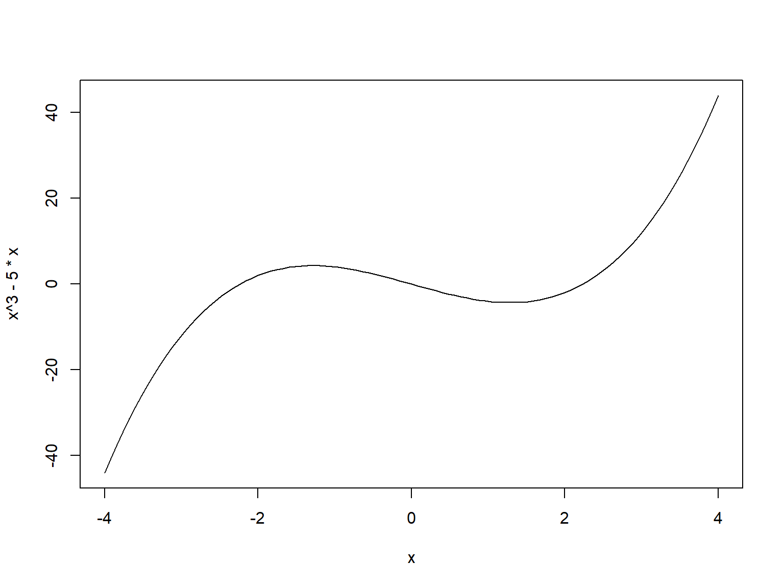
绘制用户自定义的函数图像
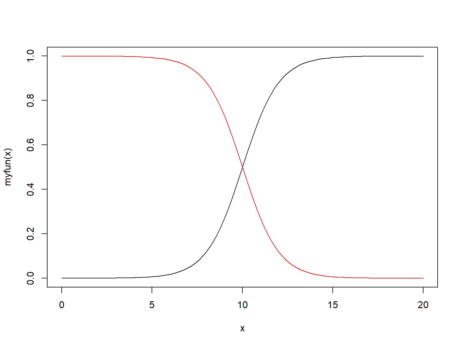
2.14.2 使用 ggplot2 中的 stat_function(geom = "Line") 函数
end.