---
title: "03-ggplot2 绘图——条形图"
author: "Simonzhou"
date: "2025-06-14"
date-modified: today
format:
html:
code-fold: false
code-line-numbers: true
code-highlight: true
fig_caption: true
number-sections: true
toc: true
toc-depth: 3
---
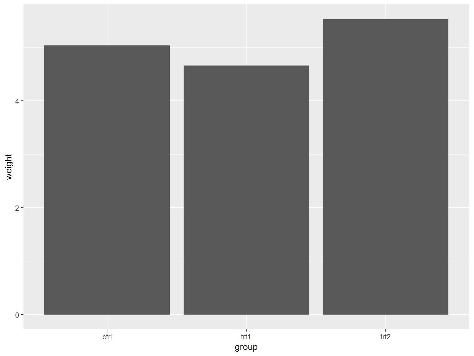
# 绘制基本条形图
## x 是离散型变量
```{r}
#| echo: true
#| output: true
#| cache: true
#| fig-show: asis # 确保图形显示
#| fig-width: 8 # 设置图形宽度
#| fig-height: 6 # 设置图形高度
library(gcookbook)  # Load gcookbook for the pg_mean data set
library(ggplot2)
ggplot(pg_mean, aes(x = group, y = weight)) +
  geom_col()
```
## x 是连续型变量
### x 是原数的连续的数值型格式
```{r}
#| echo: true
#| output: true
#| cache: true
#| fig-show: asis # 确保图形显示
#| fig-width: 8 # 设置图形宽度
#| fig-height: 6 # 设置图形高度
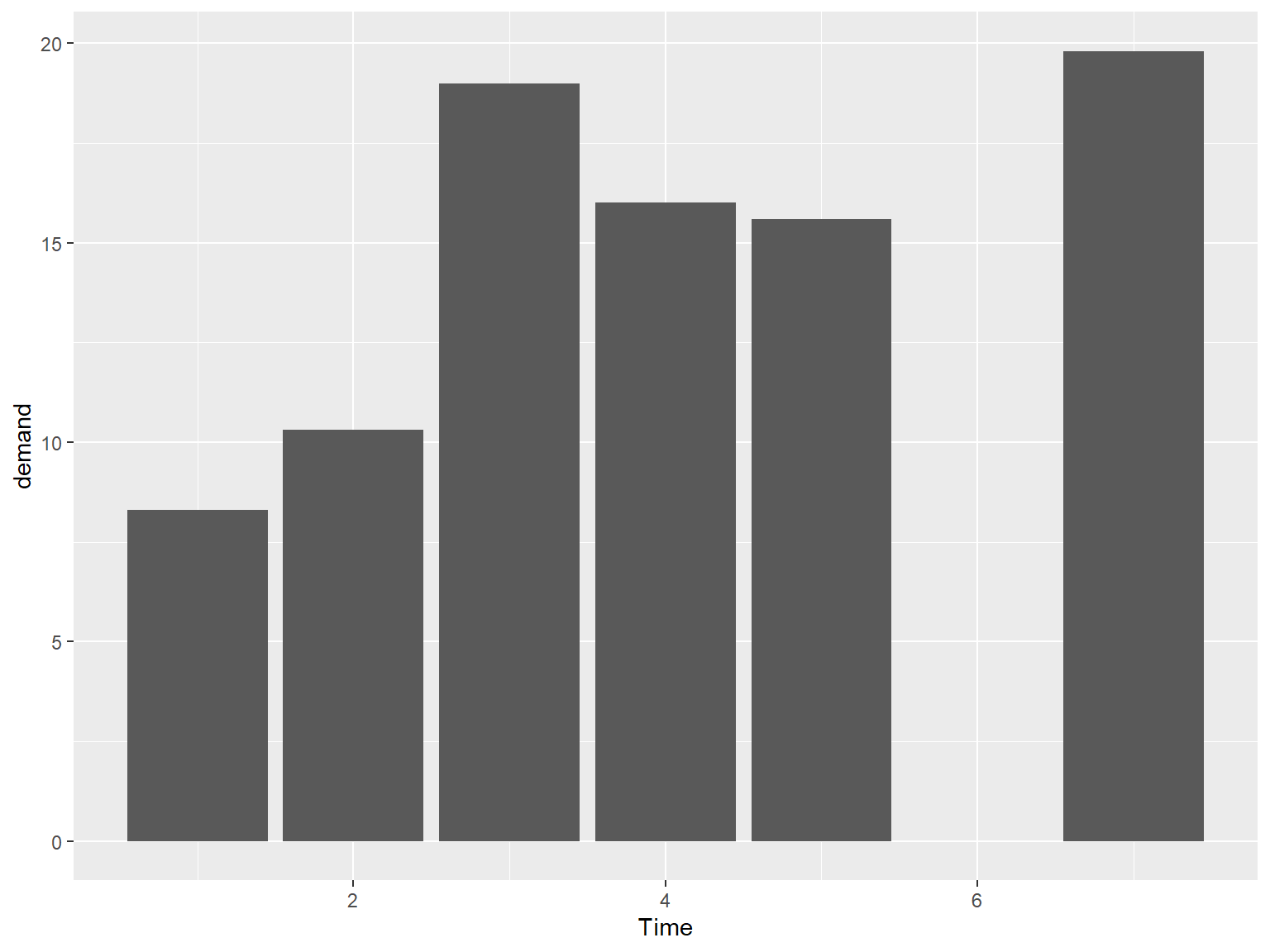
# There's no entry for Time == 6
BOD
# Time is numeric (continuous)
str(BOD)
#> 'data.frame':    6 obs. of  2 variables:
#>  $ Time  : num  1 2 3 4 5 7
#>  $ demand: num  8.3 10.3 19 16 15.6 19.8
#>  - attr(*, "reference")= chr "A1.4, p. 270"

ggplot(BOD, aes(x = Time, y = demand)) +
  geom_col()
```
### x 转换为因子型变量
```{r}
#| echo: true
#| output: true
#| cache: true
#| fig-show: asis # 确保图形显示
#| fig-width: 8 # 设置图形宽度
#| fig-height: 6 # 设置图形高度
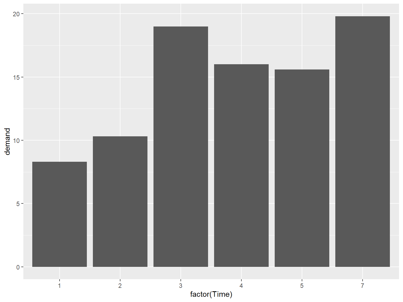
# There's no entry for Time == 6
BOD
# Convert Time to a discrete (categorical) variable with factor()
ggplot(BOD, aes(x = factor(Time), y = demand)) +
  geom_col()
```
## 调整配色
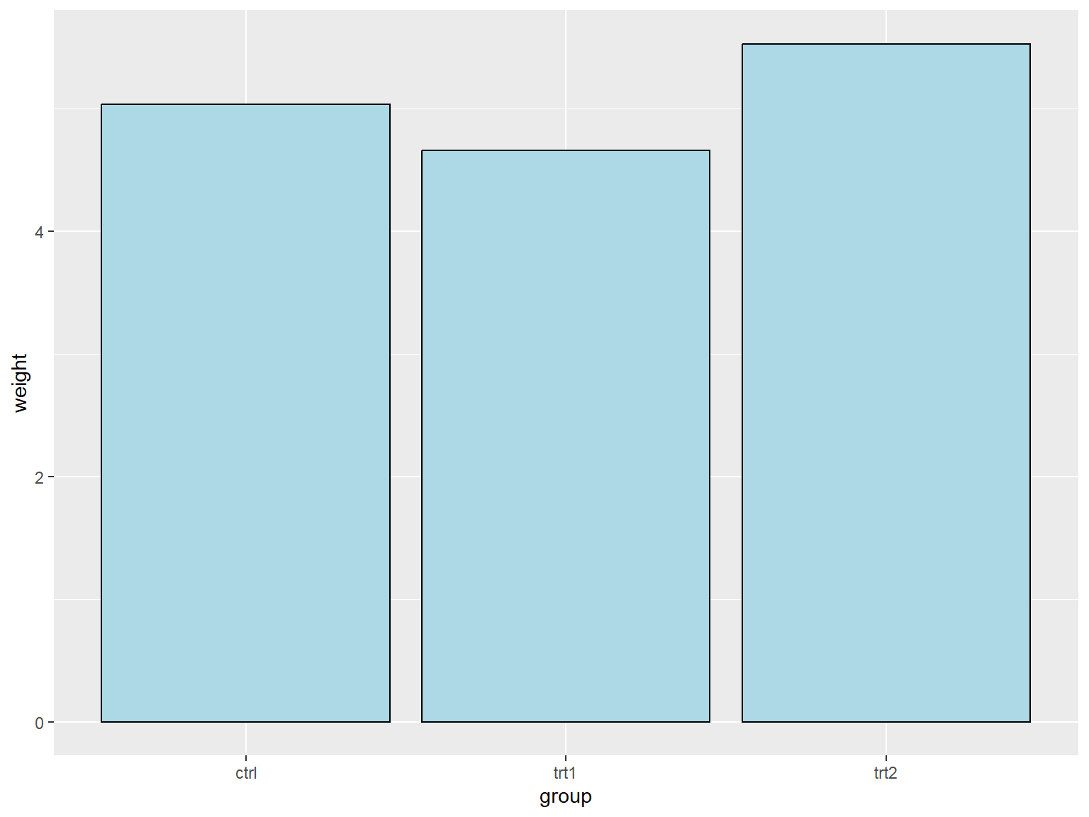
在默认的设置下,条形图的填充色为深灰色且条形图没有边框线,用户可以通过调整 `fill` 参数来改变填充色和调整 `colour/color` 参数为条形图添加边框线。
将填充色设置为浅蓝色,边框现的颜色设置为黑色:
```{r}
#| echo: true
#| output: true
#| cache: true
#| fig-show: asis # 确保图形显示
#| fig-width: 8 # 设置图形宽度
#| fig-height: 6 # 设置图形高度
library(gcookbook)  # Load gcookbook for the pg_mean data set
library(ggplot2)
ggplot(pg_mean, aes(x = group, y = weight)) +
  geom_col(fill = "lightblue",colour = "black")
```
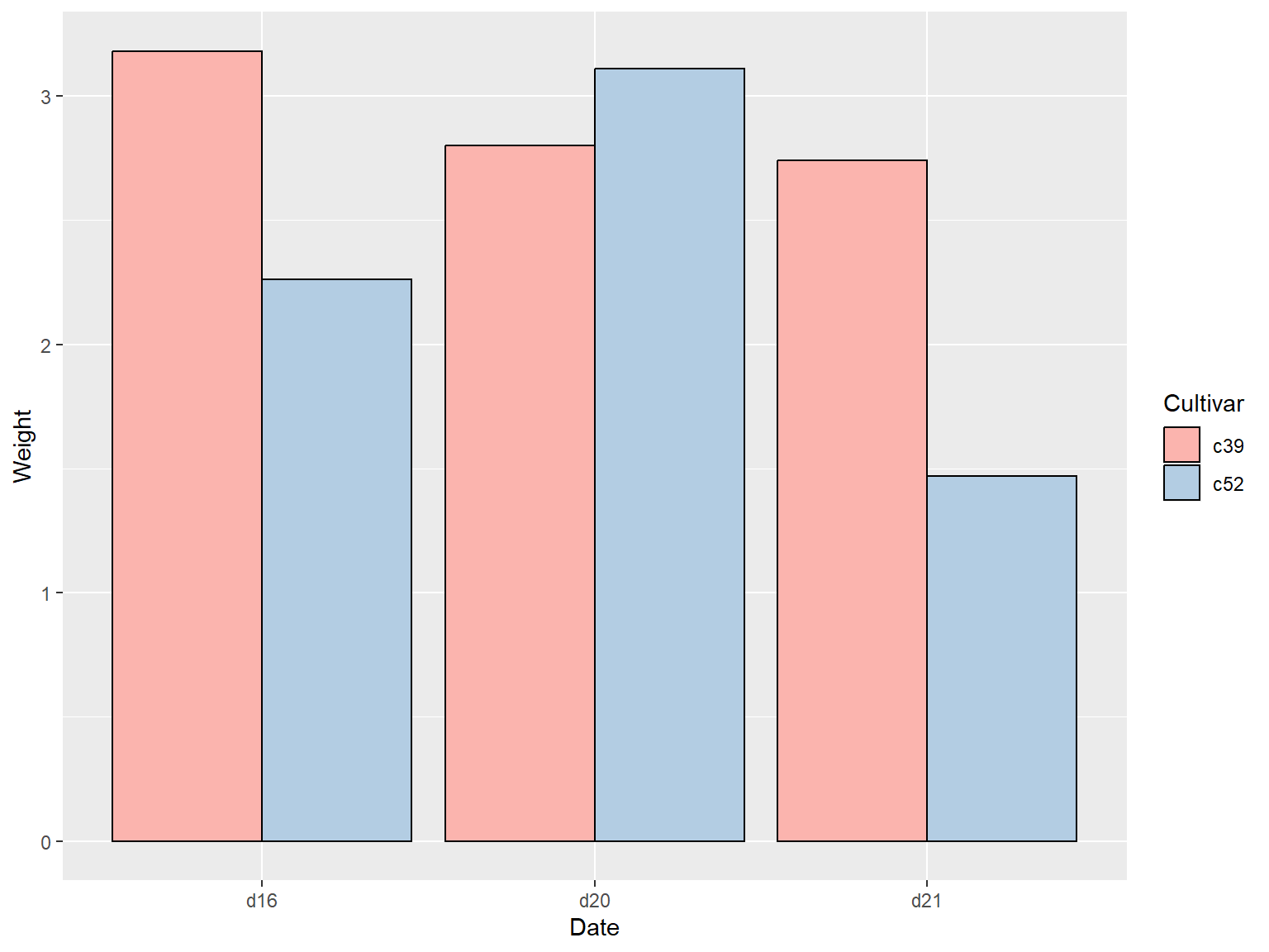
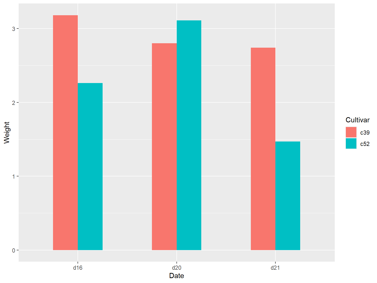
# 绘制簇状条形图
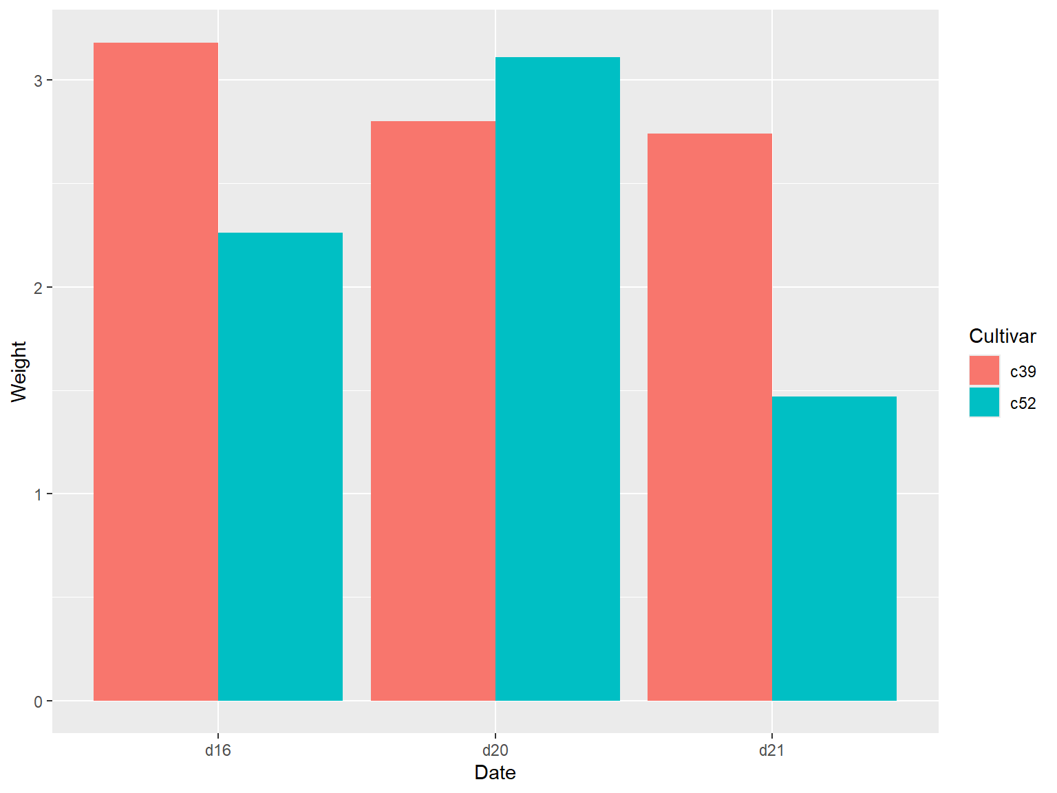
通过将分类变量映射到 `fill` 参数上,运行命令 `geom_col(position = "dodge")` 实现。
```{r}
#| echo: true
#| output: true
#| cache: true
#| fig-show: asis # 确保图形显示
#| fig-width: 8 # 设置图形宽度
#| fig-height: 6 # 设置图形高度
library(gcookbook)  # Load gcookbook for the cabbage_exp data set
# check dataset
cabbage_exp
# load ggplot2
library(ggplot2)
ggplot(cabbage_exp, aes(x = Date, y = Weight, fill = Cultivar)) +
  geom_col(position = "dodge")
```
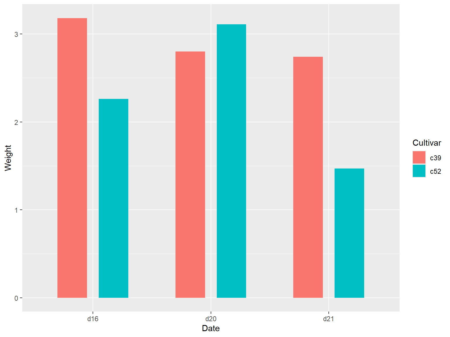
## `pastel1` 调色板
```{r}
#| echo: true
#| output: true
#| cache: true
#| fig-show: asis # 确保图形显示
#| fig-width: 8 # 设置图形宽度
#| fig-height: 6 # 设置图形高度
library(gcookbook)  # Load gcookbook for the cabbage_exp data set
# check dataset
cabbage_exp
# load ggplot2
library(ggplot2)
ggplot(cabbage_exp, aes(x = Date, y = Weight, fill = Cultivar)) +
  geom_col(position = "dodge", colour = "black") +
  scale_fill_brewer(palette = "Pastel1")
```
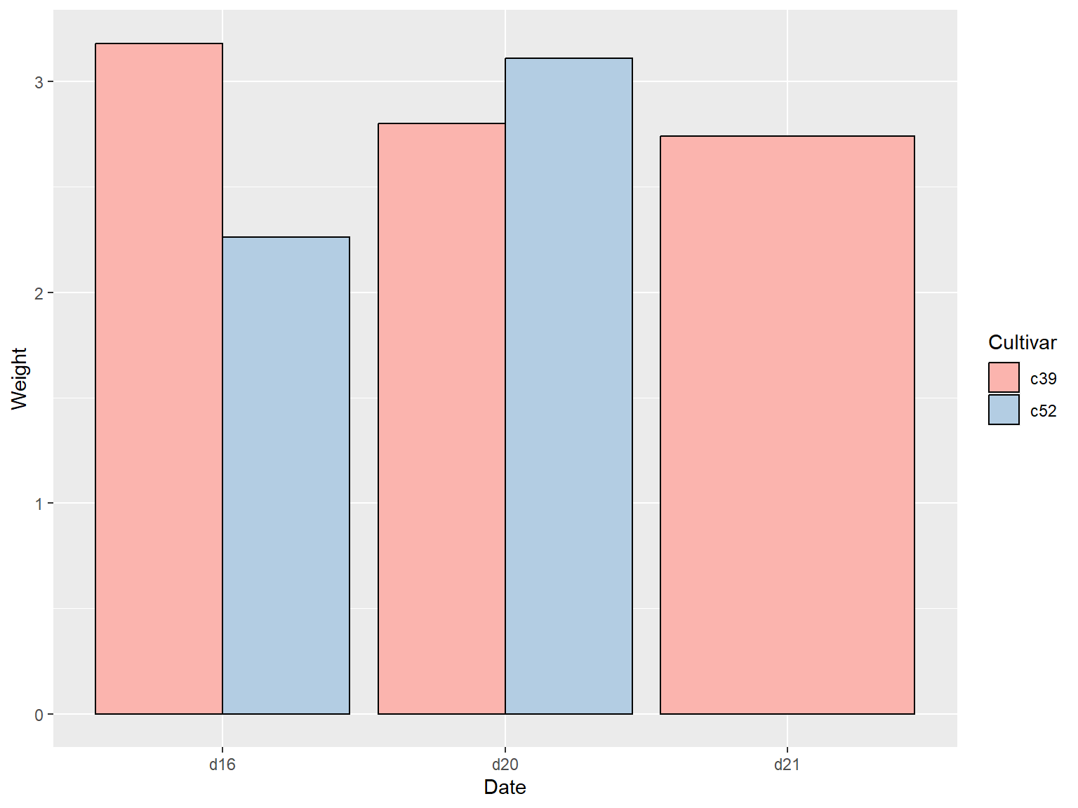
## 缺失项
如果分类变量各水平的组合中有缺失项,那么绘图结果中的条形则相应地略去不绘,同时,临近的条形将自动扩充到相应的位置,示例如下:
```{r}
#| echo: true
#| output: true
#| cache: true
#| fig-show: asis # 确保图形显示
#| fig-width: 8 # 设置图形宽度
#| fig-height: 6 # 设置图形高度
library(gcookbook)  # Load gcookbook for the cabbage_exp data set
# check dataset
cabbage_exp
# delete last row
ce <- cabbage_exp[1:5,]
ce
# load ggplot2
library(ggplot2)
ggplot(ce, aes(x = Date, y = Weight, fill = Cultivar)) +
  geom_col(position = "dodge", colour = "black") +
  scale_fill_brewer(palette = "Pastel1")
```
# 绘制频数条形图
## 使用 `geom_bar()` 函数
使用 `geom_bar()` 函数,同时不映射任何变量到y参数
```{r}
#| echo: true
#| output: true
#| cache: true
#| fig-show: asis # 确保图形显示
#| fig-width: 8 # 设置图形宽度
#| fig-height: 6 # 设置图形高度
# Equivalent to using geom_bar(stat = "bin")
ggplot(diamonds, aes(x = cut)) +
  geom_bar()
```
## 条形图着色
```{r}
#| echo: true
#| output: true
#| cache: true
#| fig-show: asis # 确保图形显示
#| fig-width: 8 # 设置图形宽度
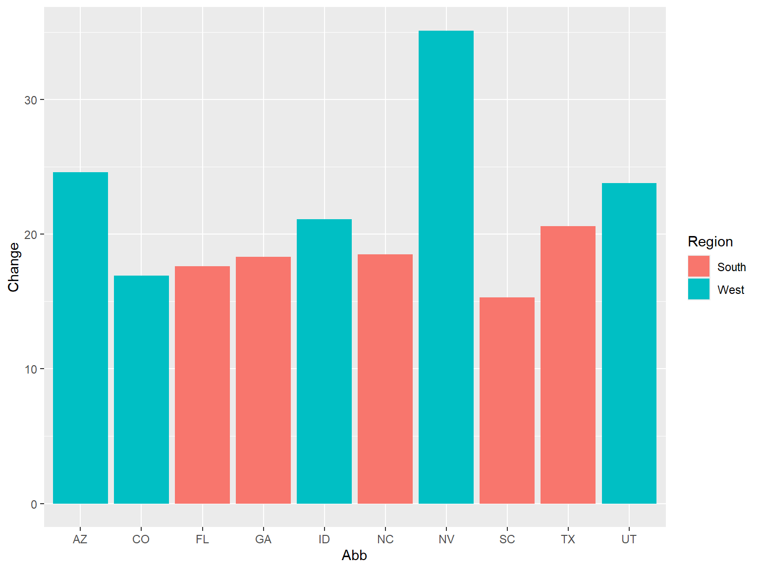
#| fig-height: 6 # 设置图形高度
library(gcookbook) # Load gcookbook for the uspopchange data set
library(dplyr)

# select top 10 state with population growth
upc <- uspopchange %>%
  arrange(desc(Change)) %>%
  slice(1:10)

upc
```
将 `Region` 映射到 `fill` 是上并绘制条形图:
```{r}
#| echo: true
#| output: true
#| cache: true
#| fig-show: asis # 确保图形显示
#| fig-width: 8 # 设置图形宽度
#| fig-height: 6 # 设置图形高度
ggplot(upc, aes(x = Abb, y = Change, fill = Region)) +
  geom_col()
```
### 设定图形颜色
借助函数 `scale_fill_brewer()` or `scale_fill_manual()` 重新设定图形颜色:
```{r}
#| echo: true
#| output: true
#| cache: true
#| fig-show: asis # 确保图形显示
#| fig-width: 8 # 设置图形宽度
#| fig-height: 6 # 设置图形高度
ggplot(upc, aes(x = reorder(Abb, Change), y = Change, fill = Region)) +
  geom_col(colour = "black") +
  scale_fill_manual(values = c("#669933", "#FFCC66")) +
  xlab("State")
```
### 注意
颜色的映射是在 `aes()` 内部完成的,但是颜色的设定是在 `aes()` 外部完成的。
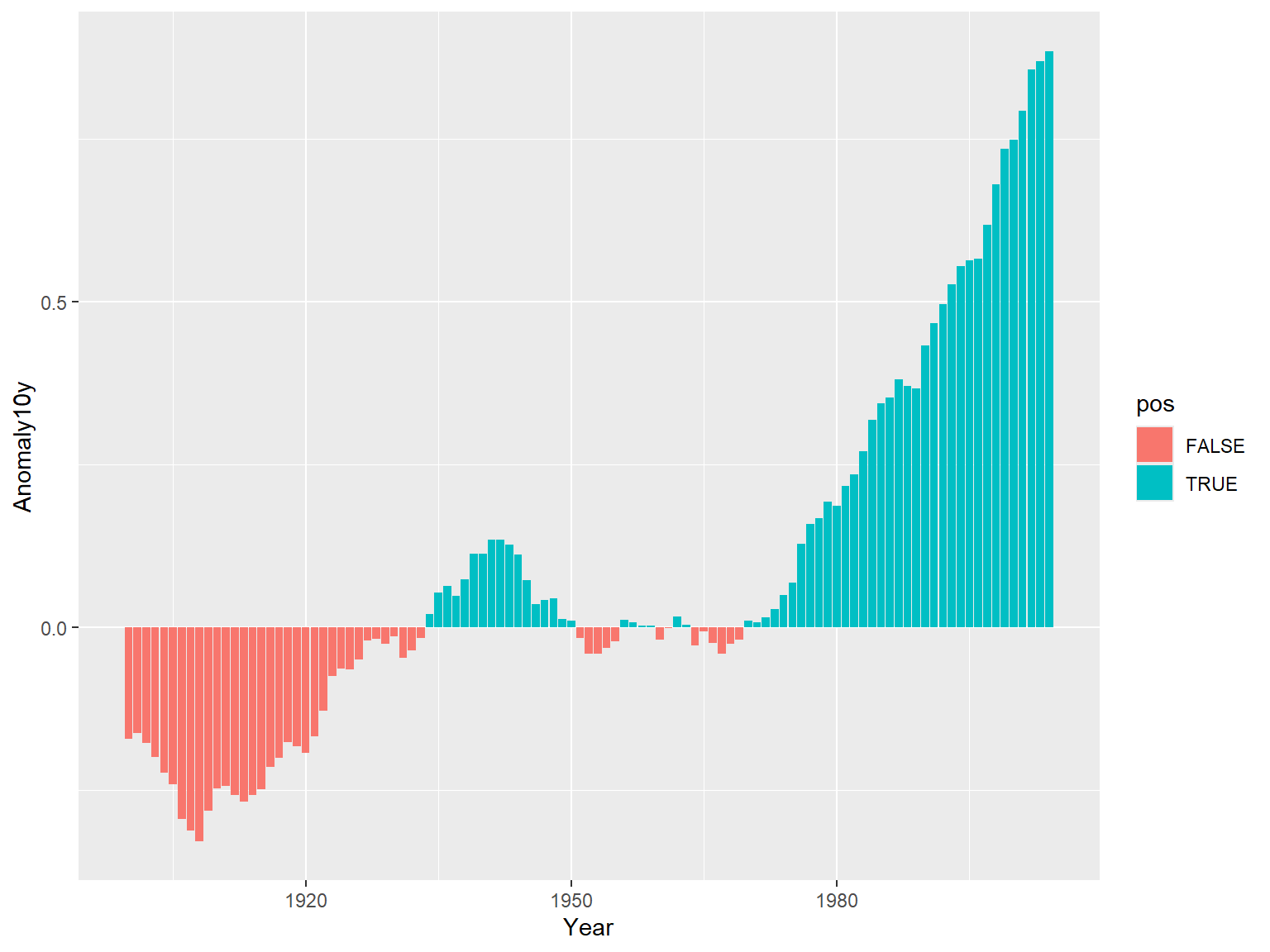
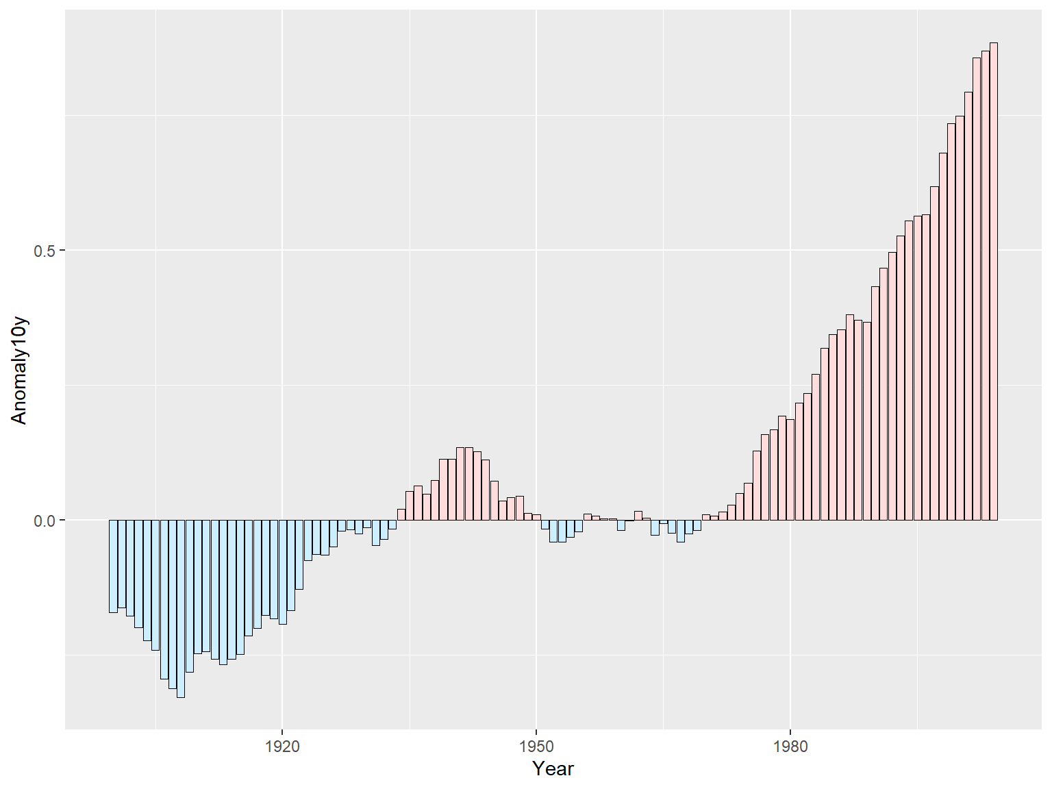
# 对正负条形图分别着色
首先创建一个取值正负性进行标识的变量 `pos` :
```{r}
#| echo: true
#| output: true
#| cache: true
#| fig-show: asis # 确保图形显示
#| fig-width: 8 # 设置图形宽度
#| fig-height: 6 # 设置图形高度
library(gcookbook) # Load gcookbook for the climate data set
library(dplyr)

climate_sub <- climate %>%
  filter(Source == "Berkeley" & Year >= 1900) %>%
  mutate(pos = Anomaly10y >= 0)

# 展示前10行
print("前10行数据:")
head(climate_sub, 10)
```
## `pos` 映射到 `fill` 中
```{r}
#| echo: true
#| output: true
#| cache: true
#| fig-show: asis # 确保图形显示
#| fig-width: 8 # 设置图形宽度
#| fig-height: 6 # 设置图形高度
library(ggplot2)
ggplot(climate_sub, aes(x = Year, y = Anomaly10y, fill = pos)) +
  geom_col(position = "identity")
```
### 注意
这里条形图的参数设定为 `position = "identity"` ,可以避免系统因对负值绘制堆积条形而发出的警告信息。
## 调整配色
### `scale_fill_manual()` 参数
设定 `scale_fill_manual()` 参数对图形进行调整,设定参数 `guide = FALSE` 可以删除图例;设定边框颜色(color/colour)和边框线宽度(size),这里边框线的单位是毫米。
```{r}
#| echo: true
#| output: true
#| cache: true
#| fig-show: asis # 确保图形显示
#| fig-width: 8 # 设置图形宽度
#| fig-height: 6 # 设置图形高度
ggplot(climate_sub, aes(x = Year, y = Anomaly10y, fill = pos)) +
  geom_col(position = "identity", colour = "black", size = 0.25) +
  scale_fill_manual(values = c("#CCEEFF", "#FFDDDD"), guide = FALSE)
```
出现警告信息(Warning messages)
调整后:
```{r}
#| echo: true
#| output: true
#| cache: true
#| fig-show: asis # 确保图形显示
#| fig-width: 8 # 设置图形宽度
#| fig-height: 6 # 设置图形高度
ggplot(climate_sub, aes(x = Year, y = Anomaly10y, fill = pos)) +
  geom_col(position = "identity", colour = "black", linewidth = 0.25) +
  scale_fill_manual(values = c("#CCEEFF", "#FFDDDD"), guide = "none")
```
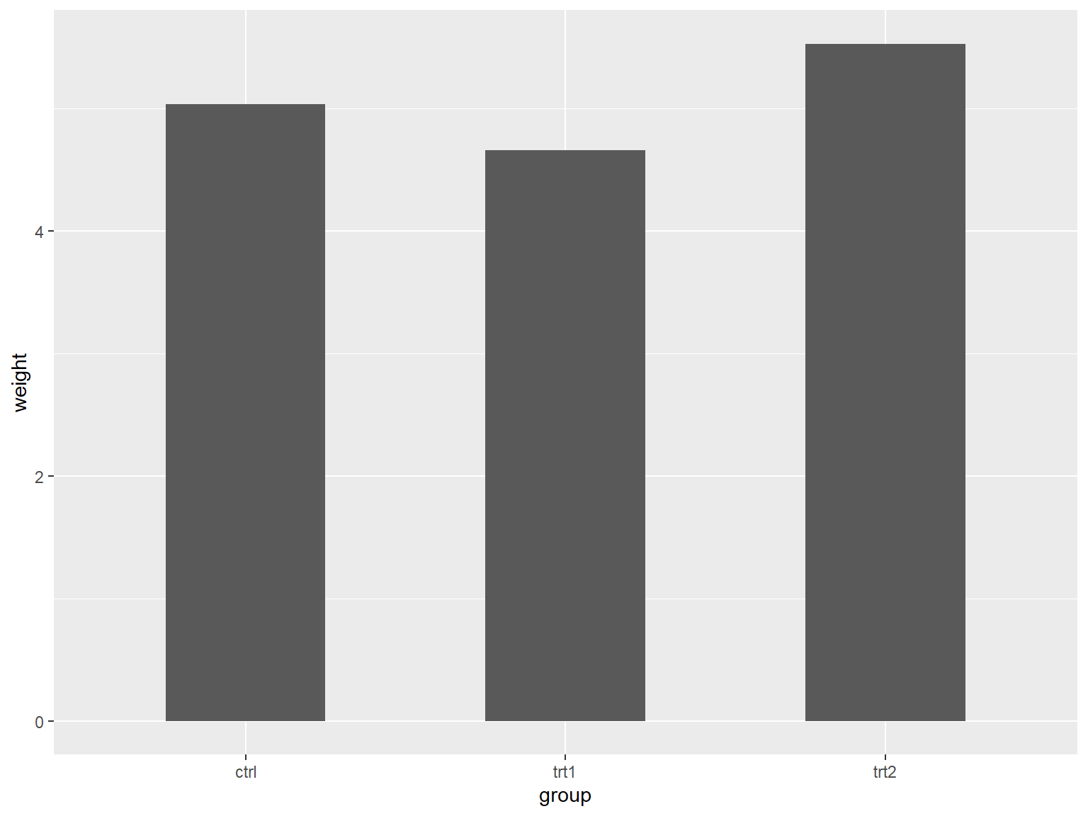
# 调整条形宽度和条形间距
通过设定 `geom_bar()` 函数的参数 `width` 来使条形变得更宽或更窄,该参数默认函数为 0.9,更大的值会使条形更宽,反之更窄(细)。
## 标准宽度
```{r}
#| echo: true
#| output: true
#| cache: true
#| fig-show: asis # 确保图形显示
#| fig-width: 8 # 设置图形宽度
#| fig-height: 6 # 设置图形高度
library(gcookbook) # Load gcookbook for the pg_mean data set
library(ggplot2)
ggplot(pg_mean, aes(x = group, y = weight)) +
  geom_col()
```
## 更窄
```{r}
#| echo: true
#| output: true
#| cache: true
#| fig-show: asis # 确保图形显示
#| fig-width: 8 # 设置图形宽度
#| fig-height: 6 # 设置图形高度
library(gcookbook) # Load gcookbook for the pg_mean data set
library(ggplot2)
ggplot(pg_mean, aes(x = group, y = weight)) +
  geom_col(width = 0.5)
```
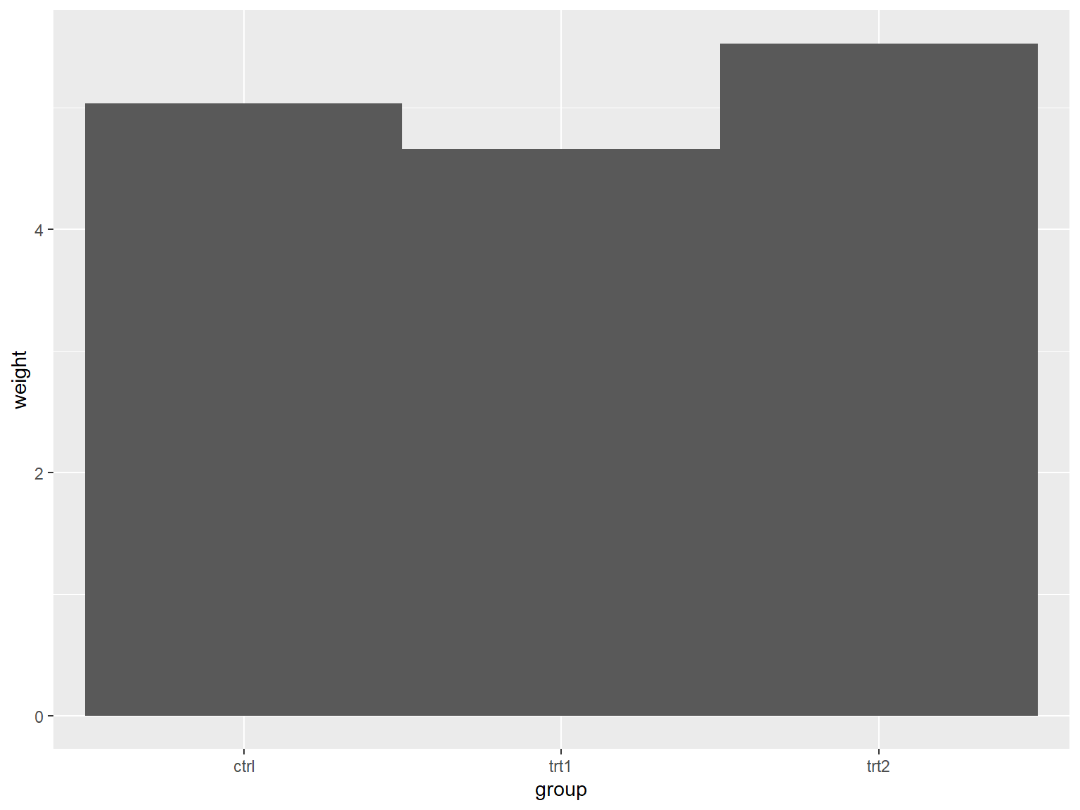
## 更宽
条形宽度的最大宽度值为1.
```{r}
#| echo: true
#| output: true
#| cache: true
#| fig-show: asis # 确保图形显示
#| fig-width: 8 # 设置图形宽度
#| fig-height: 6 # 设置图形高度
library(gcookbook) # Load gcookbook for the pg_mean data set
library(ggplot2)
ggplot(pg_mean, aes(x = group, y = weight)) +
  geom_col(width = 1)
```
## 调整组内间距
簇状条形图默认组内间距为0,如果希望增加组内间距,可以通过将 `width()` 的值设定的小一些,并将 `position_dodge()` 的值设定大于 `width()` 来实现。
### 条形更窄的簇状条形图
```{r}
#| echo: true
#| output: true
#| cache: true
#| fig-show: asis # 确保图形显示
#| fig-width: 8 # 设置图形宽度
#| fig-height: 6 # 设置图形高度
ggplot(cabbage_exp, aes(x = Date, y = Weight, fill = Cultivar)) +
  geom_col(width = 0.5, position = "dodge")
```
### 具有条形间距的簇状条形图
```{r}
#| echo: true
#| output: true
#| cache: true
#| fig-show: asis # 确保图形显示
#| fig-width: 8 # 设置图形宽度
#| fig-height: 6 # 设置图形高度
ggplot(cabbage_exp, aes(x = Date, y = Weight, fill = Cultivar)) +
  geom_col(width = 0.5, position = position_dodge(0.7))
```
### `position` 语法
以下四条命令是等价的:
``` r
geom_bar(position = "dodge")
geom_bar(width = 0.9, position = position_dodge())
geom_bar(position = position_dodge(0.9))
geom_bar(width = 0.9, position = position_dodge(width=0.9))
```
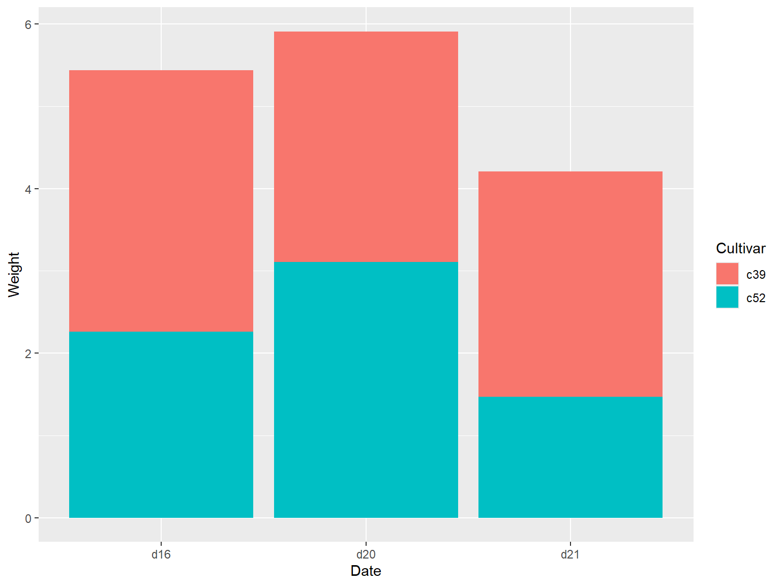
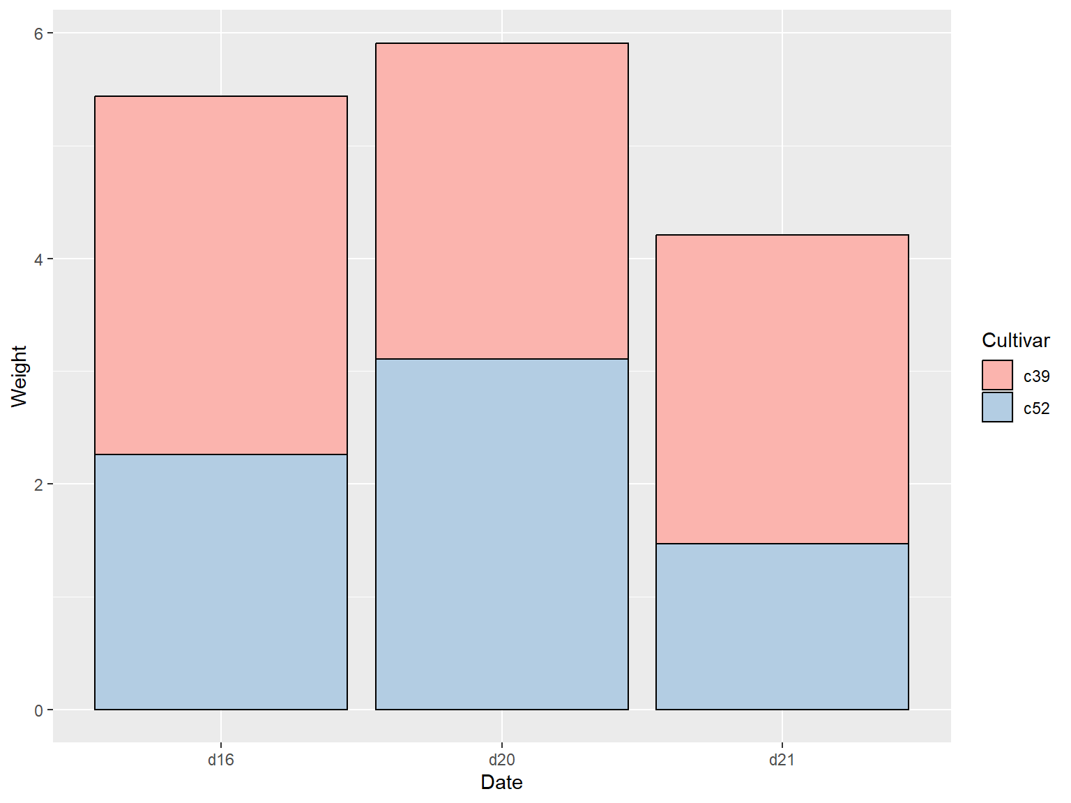
# 绘制堆积条形图
## 使用 `geom_bar()` 函数
使用 `geom_bar()` 函数,并映射一个变量给填充色参数 `fill` 即可,该命令会将 Date 对应到 x 轴上,并以 Cultivar 作为填充色
```{r}
#| echo: true
#| output: true
#| cache: true
#| fig-show: asis # 确保图形显示
#| fig-width: 8 # 设置图形宽度
#| fig-height: 6 # 设置图形高度
library(gcookbook) # Load gcookbook for the cabbage_exp data set
library(ggplot2)
ggplot(cabbage_exp, aes(x = Date, y = Weight, fill = Cultivar)) +
  geom_col()
```
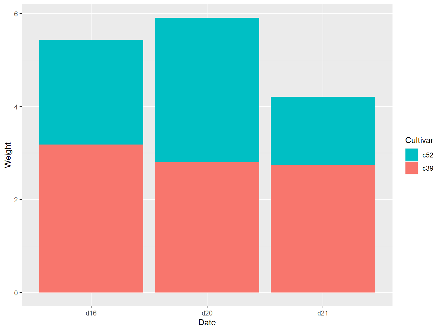
## 反转堆积顺序和图例顺序
默认情况下,条形的堆积顺序和图例顺序是一致的,但是都某些数据集而言需要调整图例顺序,用户可以通过 `guide()` 函数来对图例顺序进行调整,并指定图例所对应的需要调整的图形属性(`fill`),并使用 `position_stack(reverse = TRUE)` 参数来实现反转条形的堆积顺序,通过上述两种函数来保证图例顺序与条形顺序一致。
```{r}
#| echo: true
#| output: true
#| cache: true
#| fig-show: asis # 确保图形显示
#| fig-width: 8 # 设置图形宽度
#| fig-height: 6 # 设置图形高度
library(gcookbook) # Load gcookbook for the cabbage_exp data set
library(ggplot2)
ggplot(cabbage_exp, aes(x = Date, y = Weight, fill = Cultivar)) +
  geom_col(position = position_stack(reverse = TRUE)) +
  guides(fill = guide_legend(reverse = TRUE))
```
## 获得效果更好的条形图
使用 `scale_fill_brewer()` 函数得到一个新的调色板,最后设定 `colour="black"` 为条形添加一个黑色边框线。
```{r}
#| echo: true
#| output: true
#| cache: true
#| fig-show: asis # 确保图形显示
#| fig-width: 8 # 设置图形宽度
#| fig-height: 6 # 设置图形高度
library(gcookbook) # Load gcookbook for the cabbage_exp data set
library(ggplot2)
ggplot(cabbage_exp, aes(x = Date, y = Weight, fill = Cultivar)) +
  geom_col(colour = "black") +
  scale_fill_brewer(palette = "Pastel1")
```
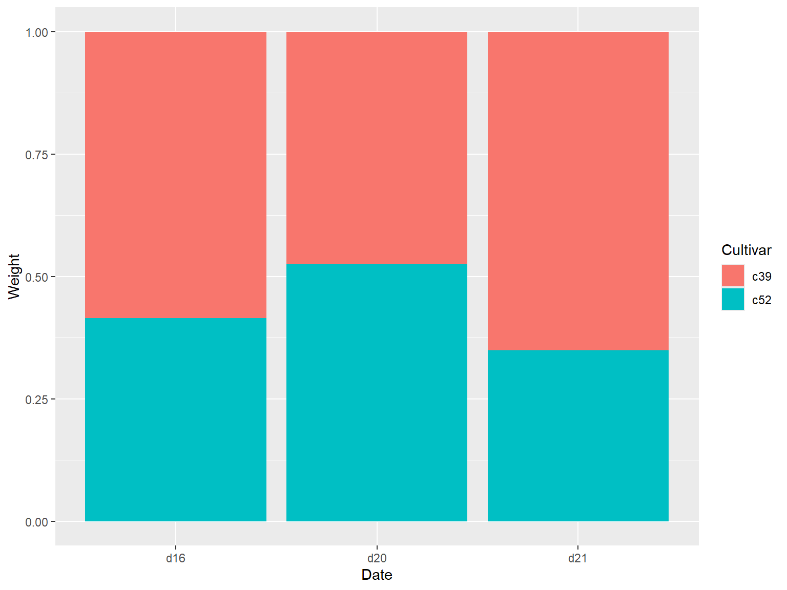
# 绘制百分比堆积条形图
## 使用 `geom_col(position = "fill")` 实现
使用 `geom_col(position = "fill")` 可以将y的值调整为0到1之间。
```{r}
#| echo: true
#| output: true
#| cache: true
#| fig-show: asis # 确保图形显示
#| fig-width: 8 # 设置图形宽度
#| fig-height: 6 # 设置图形高度
library(gcookbook) # Load gcookbook for the cabbage_exp data set

ggplot(cabbage_exp, aes(x = Date, y = Weight, fill = Cultivar)) +
  geom_col(position = "fill")
```
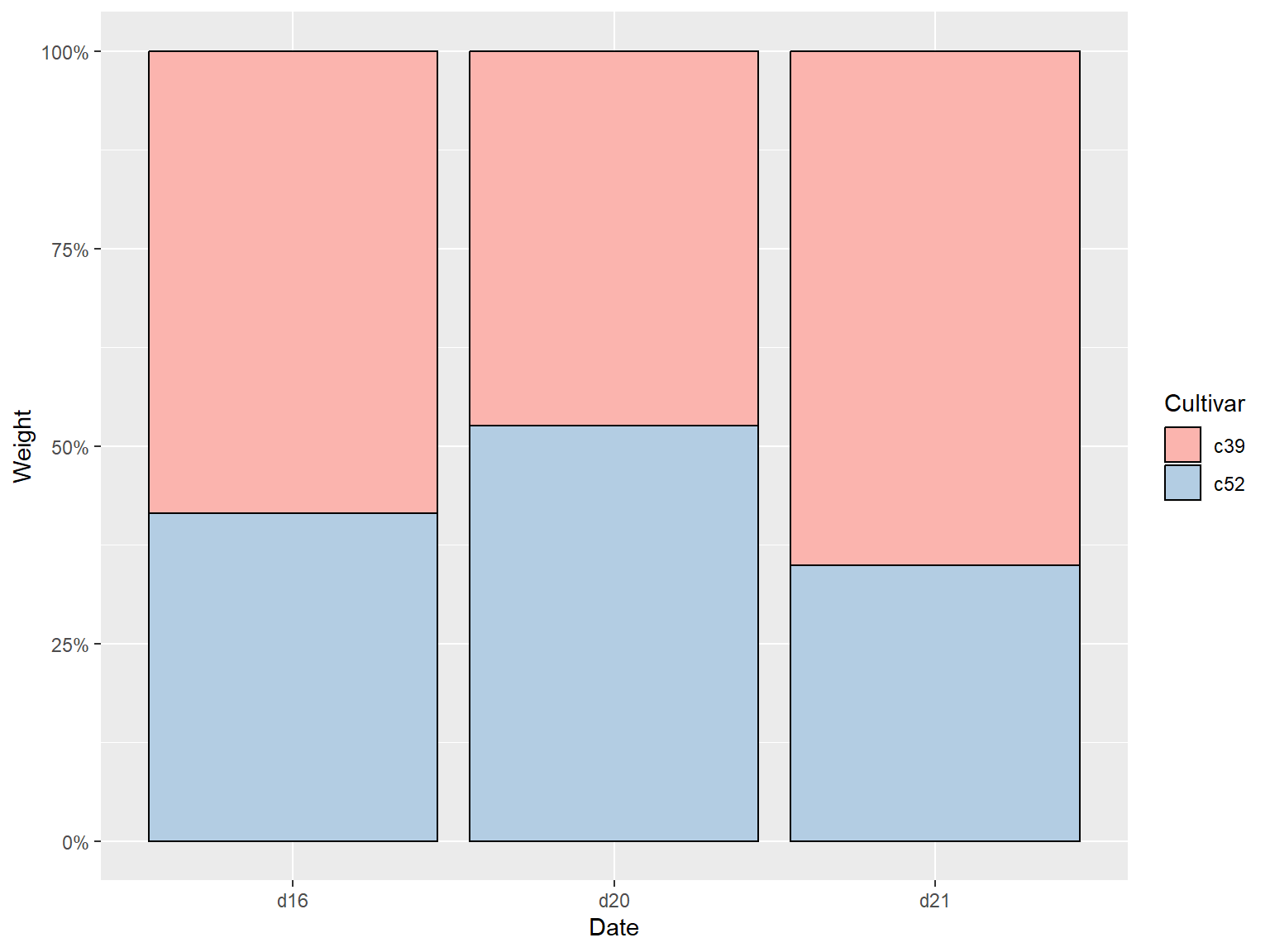
### 让标签以百分比的形式展示
```{r}
#| echo: true
#| output: true
#| cache: true
#| fig-show: asis # 确保图形显示
#| fig-width: 8 # 设置图形宽度
#| fig-height: 6 # 设置图形高度
ggplot(cabbage_exp, aes(x = Date, y = Weight, fill = Cultivar)) +
  geom_col(position = "fill") +
  scale_y_continuous(labels = scales::percent)
```
## 更换调色板并添加边框线
```{r}
#| echo: true
#| output: true
#| cache: true
#| fig-show: asis # 确保图形显示
#| fig-width: 8 # 设置图形宽度
#| fig-height: 6 # 设置图形高度
ggplot(cabbage_exp, aes(x = Date, y = Weight, fill = Cultivar)) +
  geom_col(colour = "black", position = "fill") +
  scale_y_continuous(labels = scales::percent) +
  scale_fill_brewer(palette = "Pastel1")
```
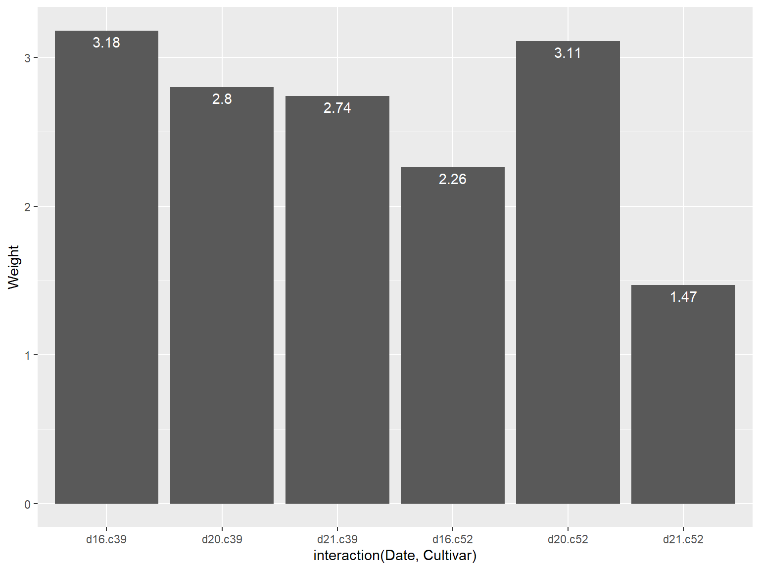
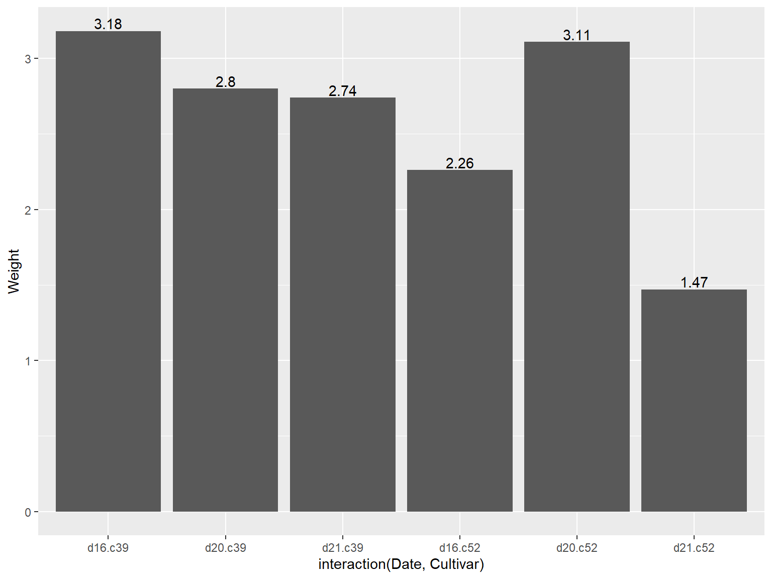
# 添加数据标签
## 使用 `geom_text()` 函数
需要分别制定一个变量映射给x、y和标签本身,通过设定 `vjust` (竖直调整数据标签位置)来将标签位置移动至条形图顶端的上方或下方
```{r}
#| echo: true
#| output: true
#| cache: true
#| fig-show: asis # 确保图形显示
#| fig-width: 8 # 设置图形宽度
#| fig-height: 6 # 设置图形高度
library(gcookbook) # Load gcookbook for the cabbage_exp data set

# Below the top
ggplot(cabbage_exp, aes(x = interaction(Date, Cultivar), y = Weight)) +
  geom_col() +
  geom_text(aes(label = Weight), vjust = 1.5, colour = "white")
# Above the top
ggplot(cabbage_exp, aes(x = interaction(Date, Cultivar), y = Weight)) +
  geom_col() +
  geom_text(aes(label = Weight), vjust = -0.2)
```
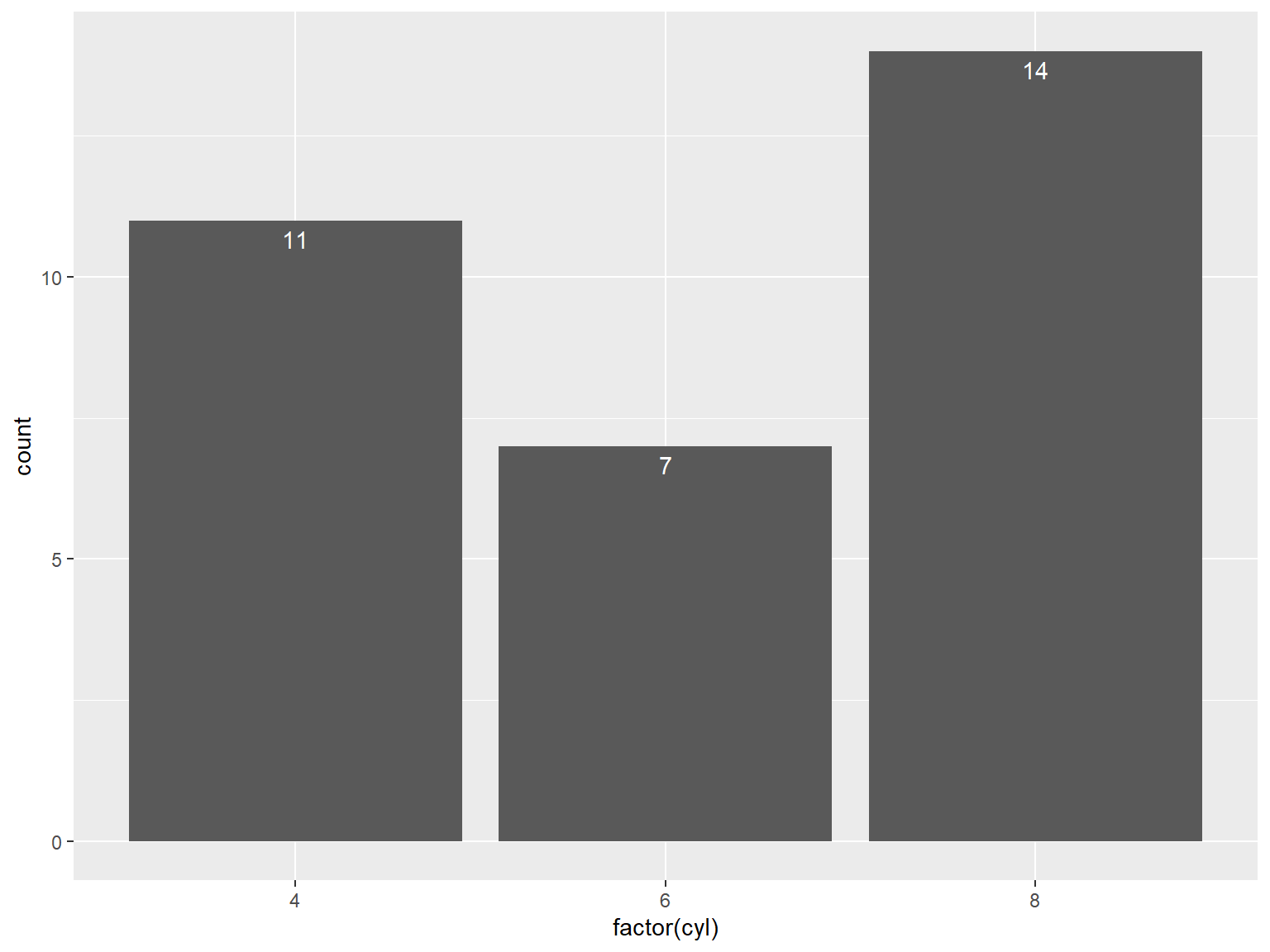
## 给频数条形图添加标签
```{r}
#| echo: true
#| output: true
#| cache: true
#| fig-show: asis # 确保图形显示
#| fig-width: 8 # 设置图形宽度
#| fig-height: 6 # 设置图形高度
ggplot(mtcars, aes(x = factor(cyl))) +
  geom_bar() +
  geom_text(aes(label = after_stat(count)), stat = "count",
            vjust = 1.5, colour = "white")
```
## 给簇状条形图添加标签
需要设定 `position = position_dodge()` 并给其一个参数来设定分类间距,分类间距默认值是0.9,因为簇状图的条形更窄,所以需要使用字号 `size` 来匹配条形宽度,数据标签的默认字号是5,用户可以设定为 3 使其看起来更小(适配)。
```{r}
#| echo: true
#| output: true
#| cache: true
#| fig-show: asis # 确保图形显示
#| fig-width: 8 # 设置图形宽度
#| fig-height: 6 # 设置图形高度
ggplot(cabbage_exp, aes(x = Date, y = Weight, fill = Cultivar)) +
  geom_col(position = "dodge") +
  geom_text(
    aes(label = Weight),
    colour = "white", size = 3,
    vjust = 1.5, position = position_dodge(.9)
  )
```
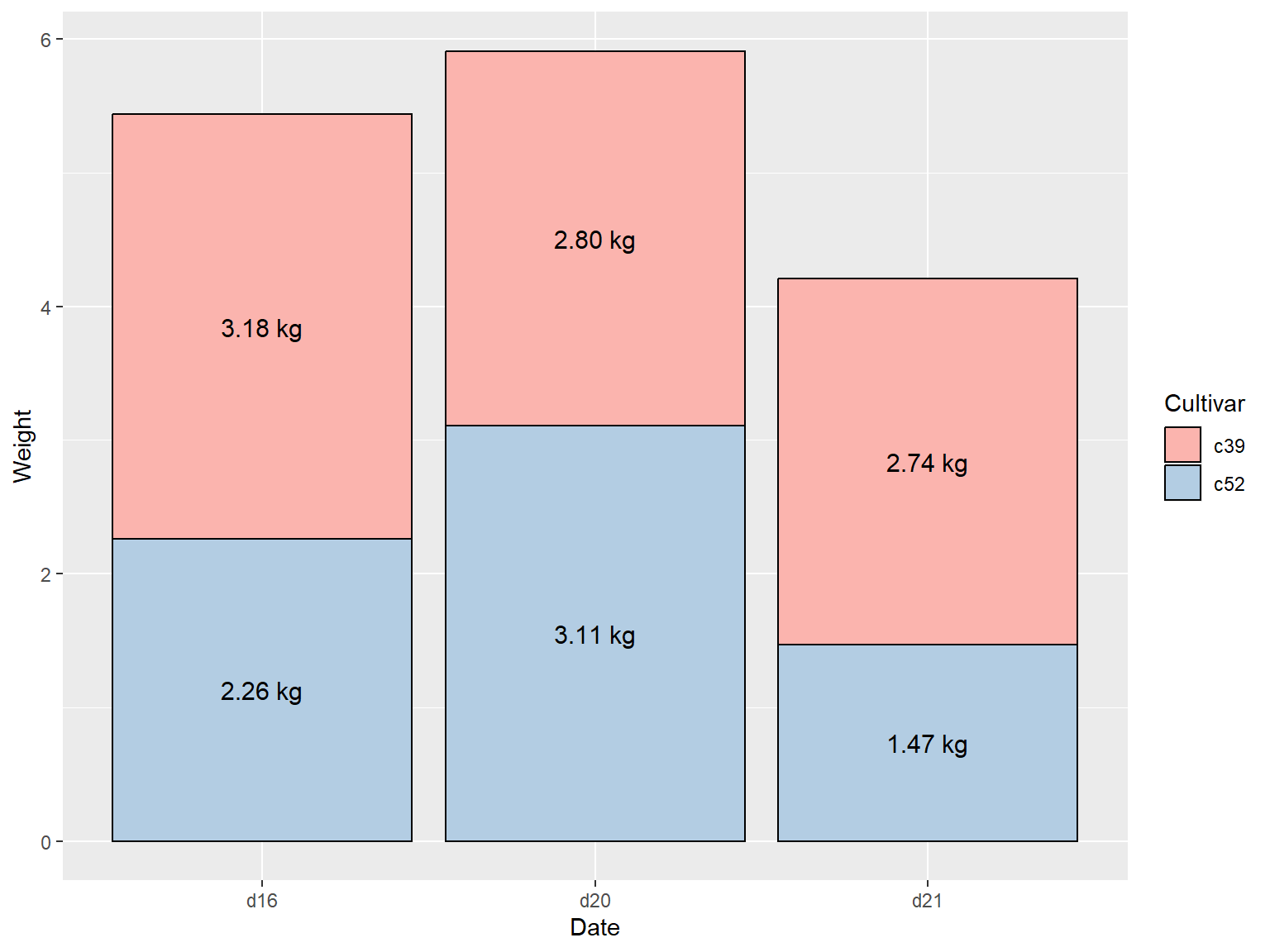
## 堆积图添加数据标签
要对堆积图添加数据标签,先要对每组条形所对应的数据进行累计求和,有需要在此之前保证数据的合理排序,否则可能会计算出错误的累计和。
使用 `dplyr` 包中的 `arrange()` 函数完成上述操作,使用 `rev()` 函数调整 Cultivar 的顺序。
```{r}
#| echo: true
#| output: true
#| cache: true
#| fig-show: asis # 确保图形显示
#| fig-width: 8 # 设置图形宽度
#| fig-height: 6 # 设置图形高度
library(dplyr)

# Sort by the Date and Cultivar columns
ce <- cabbage_exp %>%
  arrange(Date, rev(Cultivar))

# Get the cumulative sum
ce <- ce %>%
  group_by(Date) %>%
  mutate(label_y = cumsum(Weight))

ce
ggplot(ce, aes(x = Date, y = Weight, fill = Cultivar)) +
  geom_col() +
  geom_text(aes(y = label_y, label = Weight), vjust = 1.5, colour = "white")
```
## 堆积图数据标签放置在中部
如果想把数据标签放在条形中部,需要对累计求和的结果加以调整,并同时略去 `geom_bar()` 函数对 y 偏移量 `offset` 的设置。
```{r}
#| echo: true
#| output: true
#| cache: true
#| fig-show: asis # 确保图形显示
#| fig-width: 8 # 设置图形宽度
#| fig-height: 6 # 设置图形高度
library(dplyr)

ce <- cabbage_exp %>%
  arrange(Date, rev(Cultivar))

# Calculate y position, placing it in the middle
ce <- ce %>%
  group_by(Date) %>%
  mutate(label_y = cumsum(Weight) - 0.5 * Weight)

ggplot(ce, aes(x = Date, y = Weight, fill = Cultivar)) +
  geom_col() +
  geom_text(aes(y = label_y, label = Weight), colour = "white")
```
## 添加要素
1. 修改颜色
2. 将数据标签置于中间
3. 缩小标签字号 `size`
4. 调用 `paste()` 函数给标签添加后缀
5. 使用 `format()` 函数保留两位小数
```{r}
#| echo: true
#| output: true
#| cache: true
#| fig-show: asis # 确保图形显示
#| fig-width: 8 # 设置图形宽度
#| fig-height: 6 # 设置图形高度
ggplot(ce, aes(x = Date, y = Weight, fill = Cultivar)) +
  geom_col(colour = "black") +
  geom_text(aes(y = label_y, label = paste(format(Weight, nsmall = 2), "kg")), size = 4) +
  scale_fill_brewer(palette = "Pastel1")
```
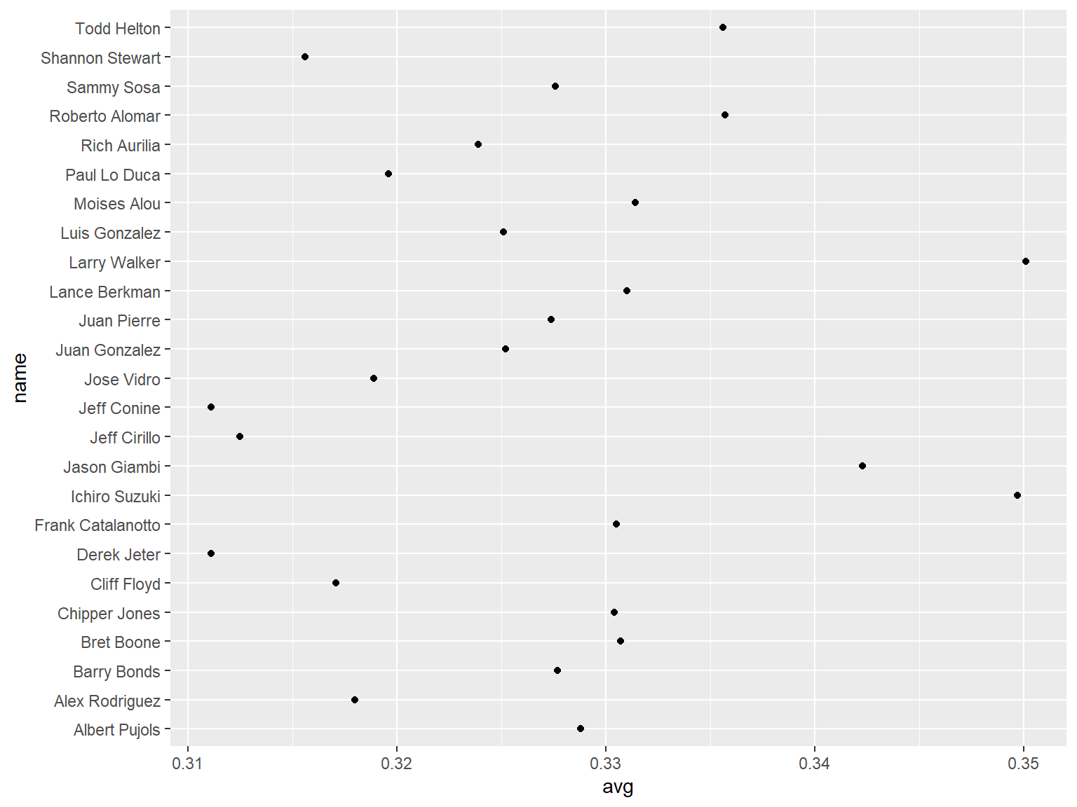
# 绘制Cleveland点图
Cleveland点图是条形图的替代方案,它可以减少图形造成的视觉混乱并使图形更具可读性。
## 使用 `geom_point()` 命令
```{r}
#| echo: true
#| output: true
#| cache: true
#| fig-show: asis # 确保图形显示
#| fig-width: 8 # 设置图形宽度
#| fig-height: 6 # 设置图形高度
library(gcookbook) # Load gcookbook for the tophitters2001 data set
tophit <- tophitters2001[1:25, ] # Take the top 25 from the tophitters data set

ggplot(tophit, aes(x = avg, y = name)) +
  geom_point()
```
## 修改排序
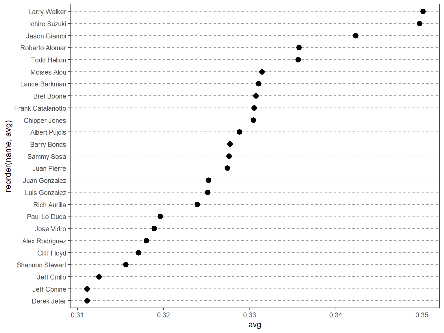
尽管 `tophit` 函数的行排序恰好是根据 `avg` 变量进行排序的,但这并不意味着在图中的也是这样进行排序;在默认的点图设置下,坐标轴上的变量通畅会根据变量类型自动选取合适的排序方式。
这里,变量 `name` 属于字符串类型,因此,点图根据字母先后顺序对其进行了排序;当变量是因子型变量时,点图会根据定义好的因子水平顺序对其进行排序。
用户可以使用 `reorder(name,avg)` 函数实现这一过程,该过程会先将 `name` 变量转换为因子,然后,根据 `avg` 变量的大小对其进行排序。
为了使图形效果更好,用户可以使用图形主题系统(theming system)删除垂直网格线,并将水平网格线的线性修改为虚线。
```{r}
#| echo: true
#| output: true
#| cache: true
#| fig-show: asis # 确保图形显示
#| fig-width: 8 # 设置图形宽度
#| fig-height: 6 # 设置图形高度
library(gcookbook) # Load gcookbook for the tophitters2001 data set
tophit <- tophitters2001[1:25, ] # Take the top 25 from the tophitters data set
library(ggplot2)
ggplot(tophit, aes(x = avg, y = reorder(name, avg))) +
  geom_point(size = 3) +  # Use a larger dot
  theme_bw() +
  theme(
    panel.grid.major.x = element_blank(),
    panel.grid.minor.x = element_blank(),
    panel.grid.major.y = element_line(colour = "grey60", linetype = "dashed")
  )
```
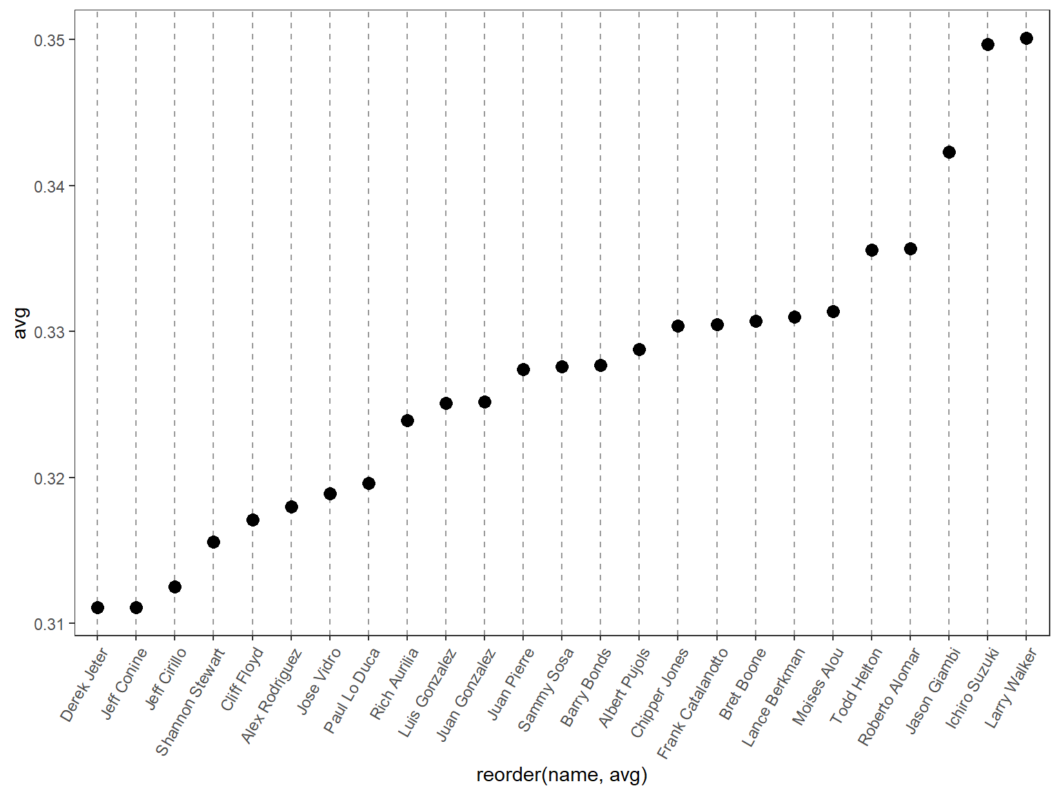
## 旋转点图
将点图的x轴和y轴互换,互换后,x轴对应名称,y轴对应数值,同时将标签旋转60°。
```{r}
#| echo: true
#| output: true
#| cache: true
#| fig-show: asis # 确保图形显示
#| fig-width: 8 # 设置图形宽度
#| fig-height: 6 # 设置图形高度
ggplot(tophit, aes(x = reorder(name, avg), y = avg)) +
  geom_point(size = 3) +  # Use a larger dot
  theme_bw() +
  theme(
    panel.grid.major.y = element_blank(),
    panel.grid.minor.y = element_blank(),
    panel.grid.major.x = element_line(colour = "grey60", linetype = "dashed"),
    axis.text.x = element_text(angle = 60, hjust = 1)
  )
```
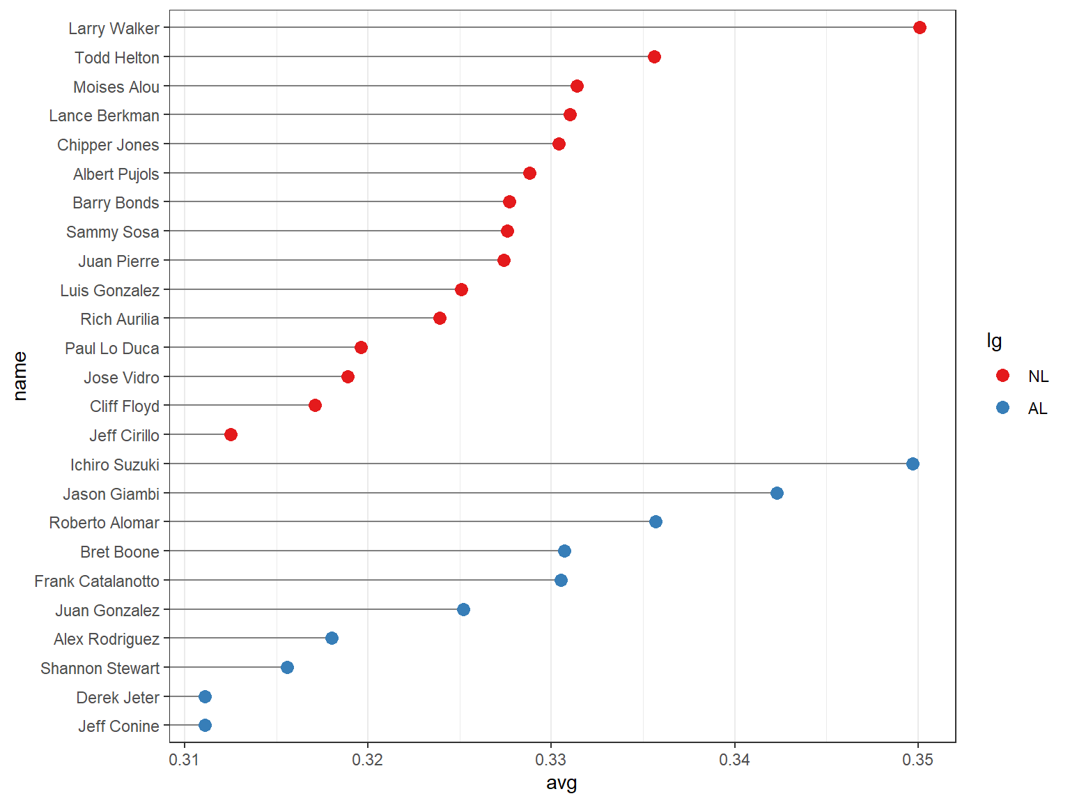
## 分组
因为前面已将 name 转为因子型变量,可以视作为一种分类变量,现在再根据因子 lg 对样本进行分组,因子 lg 有两个水平,分别是 NL 和 AL;一次依据 lg 和 avg 对变量进行排序。
需要注意的是, `reorder()` 函数只能根据一个变量对因子水平进行排序,所以这里只能手动来实现 lg 和 avg 进行排序。
```{r}
#| echo: true
#| output: true
#| cache: true
#| fig-show: asis # 确保图形显示
#| fig-width: 8 # 设置图形宽度
#| fig-height: 6 # 设置图形高度
# Get the names, sorted first by lg, then by avg
nameorder <- tophit$name[order(tophit$lg, tophit$avg)]

# Turn name into a factor, with levels in the order of nameorder
tophit$name <- factor(tophit$name, levels = nameorder)
```
将 lg 变量映射到点的颜色属性上,借助 `geom_segment()` 函数来实现“以数据点为端点的线段”代替贯通全图的网格线。
需要注意的是, `geom_segment()` 函数需要设定 `x`、`y`、`xend`和 `yend` 四个参数.
```{r}
#| echo: true
#| output: true
#| cache: true
#| fig-show: asis # 确保图形显示
#| fig-width: 8 # 设置图形宽度
#| fig-height: 6 # 设置图形高度
ggplot(tophit, aes(x = avg, y = name)) +
  geom_segment(aes(yend = name), xend = 0, colour = "grey50") +
  geom_point(size = 3, aes(colour = lg)) +
  scale_colour_brewer(palette = "Set1", limits = c("NL", "AL")) +
  theme_bw() +
  theme(
    panel.grid.major.y = element_blank(),   # 无水平网格线
    legend.position = "right",              # 图例放在右侧
    legend.justification = c(1, 0.5),       # 图例对齐方式
    legend.box.just = "right"               # 图例框靠右对齐
  )
```
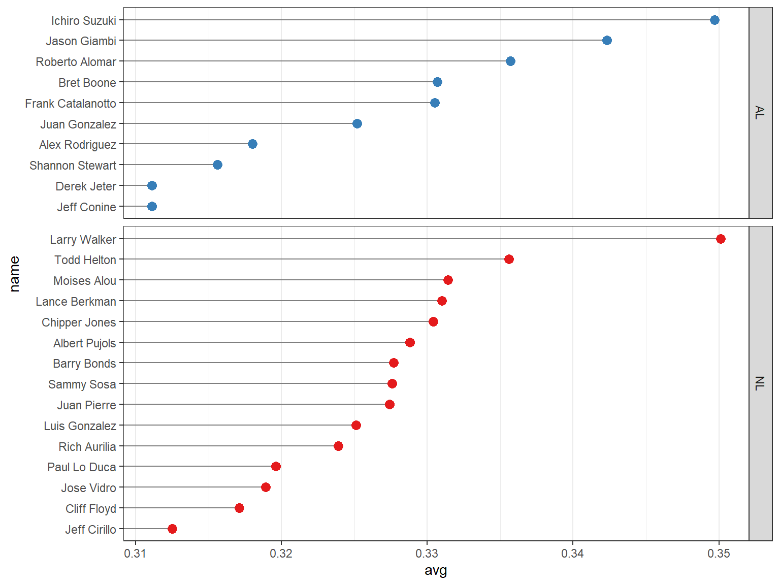
## 分组2:分面展示
通过调整 `lg` 变量的因子水平来修改分面显示的堆叠顺序。
```{r}
#| echo: true
#| output: true
#| cache: true
#| fig-show: asis # 确保图形显示
#| fig-width: 8 # 设置图形宽度
#| fig-height: 6 # 设置图形高度
ggplot(tophit, aes(x = avg, y = name)) +
  geom_segment(aes(yend = name), xend = 0, colour = "grey50") +
  geom_point(size = 3, aes(colour = lg)) +
  scale_colour_brewer(palette = "Set1", limits = c("NL", "AL"), guide = "none") +
  theme_bw() +
  theme(panel.grid.major.y = element_blank()) +
  facet_grid(lg ~ ., scales = "free_y", space = "free_y")
```
end.